
BMI vs. body fat %
An exploration of NHANES 2018

In my previous post I discussed commonly found normal distribution in humans. In general, these result from many small independent causes in different directions which when averaged result in a normal distribution. Here's a quick visualization:
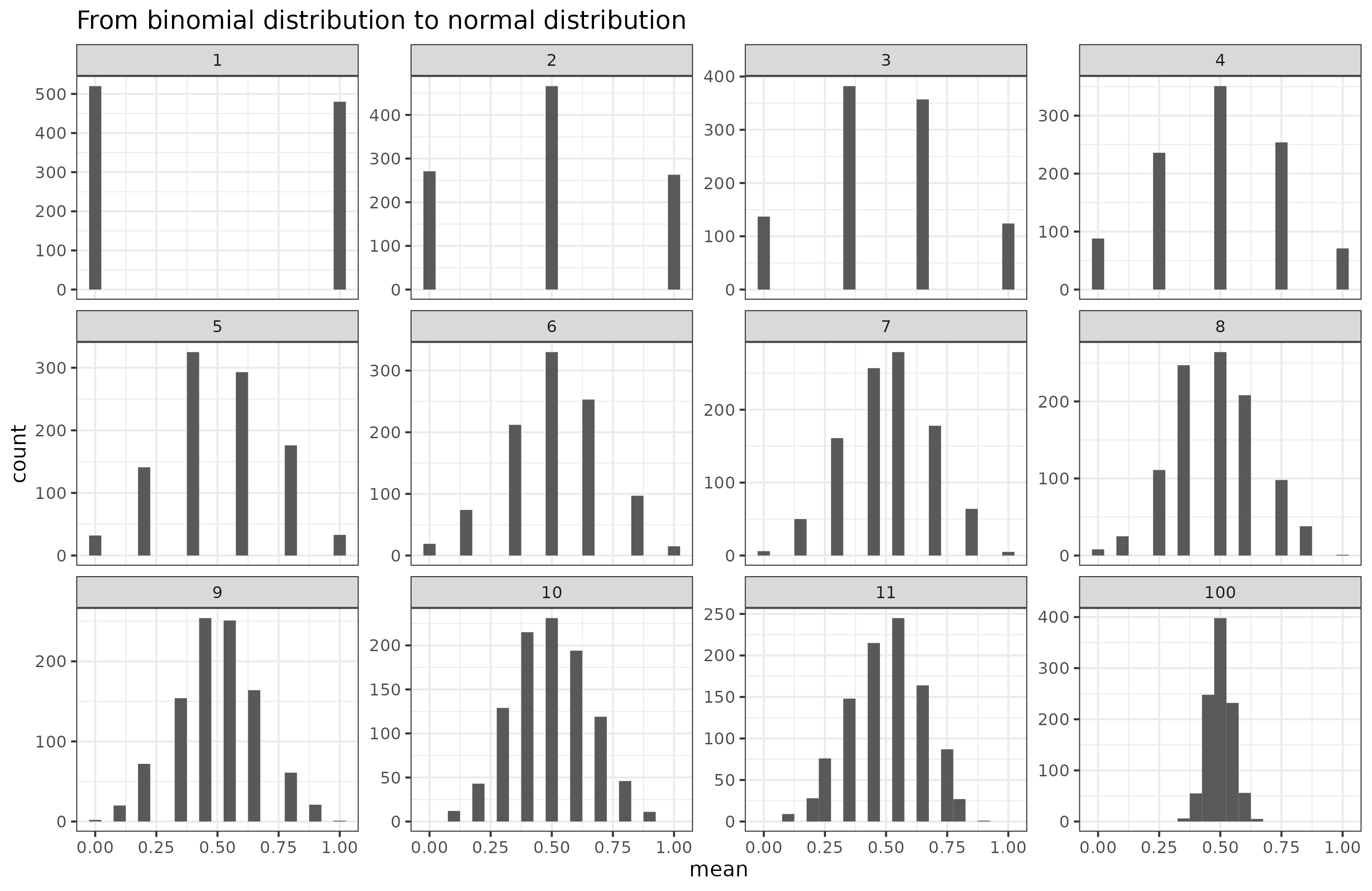
Imagine flipping coins. You begin with 1 coin, then take the average of the number of heads. With only 1 coin, you end up with about 50% of 0's and 1's. Then take 2 coins and repeat, then 3 coins etc. As the number of coins goes towards infinity, the resulting histogram looks more and more like the normal distribution. Many human phenotypes (anything measurable) result from many such causes. Pretty much all of these have a large genetic component composed of many different genetic variations across the genome. Such phenotypes are called polygenic. Height is the go-to example case of this, but what about weight? Here's some data for American adults (age 20+) from NHANES 2018:

Men weigh more than women, but not because they are more fat in some sense, but rather because they are larger. While one could use body size measures, we will just use height, which looks like this: Notice that the male distribution is a bit flatter, which is to say, men have a larger standard deviation than women (for Whites: means are 175 and 161 cm, and SD's are 7.1 and 6.9, d = 2.0). This is part of the usual greater male variance phenomenon.
Clearly then, if we want to get some idea of how fat a person is, we need to adjust weight for height in some way. The most popular way to get an idea of how fat a person is, is to use the BMI metric:
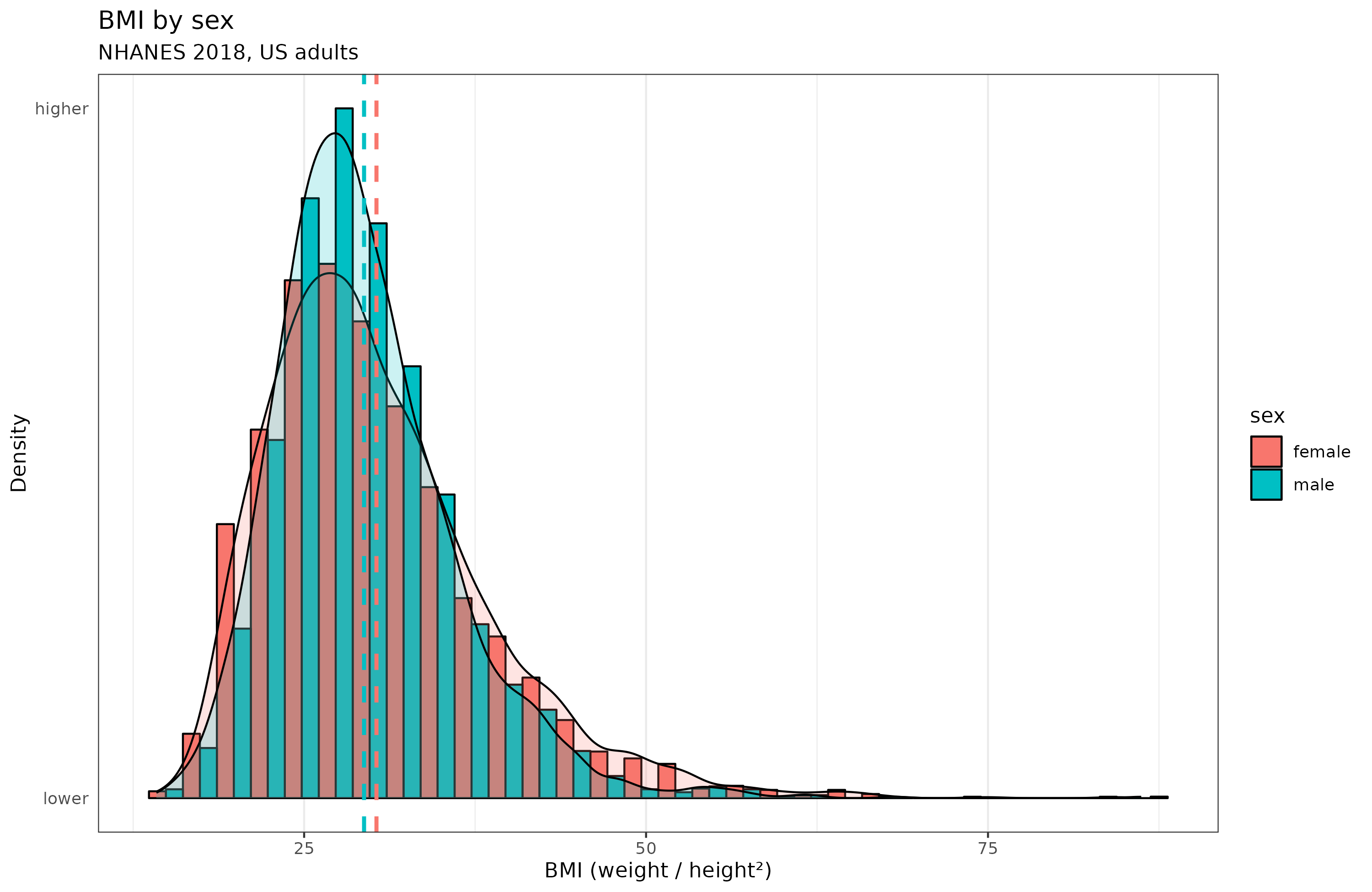
Curiously, women have more variation than men in BMI. But notice also that the weight metrics have long right tails. This results from the fact that starvation will kill you, so we don't observe men who weigh 40 kg because it is almost impossible to be that skinny and alive. In the same way, we don't observe anyone with a BMI below 14 in the dataset of 5.6k adults. On the other hand, there's no hard limit on being fat, and we see some people who weigh up to 250 kg. The world record is 635 kg (about 2 adult male grizzly bears), and he died at age 41.
Many people dislike BMI because it ignores body composition, shoulder width and muscle mass, instead they prefer body fat %. However, BMI is a quite decent predictor, or proxy of, body fat %. Datasets with body fat % measured directly are rare, but NHANES 2018 did this using x-rays. The distribution looks like this:

Both distributions show a long tail, but this time it's on the left side, opposite that of BMI and weight. Curious. What does the relationship between body fat and BMI look like?

The relationship is mostly linear, but not entirely. It seems more nonlinear for women than men. In terms of correlations, BMI is an excellent proxy: 0.74 for men and 0.76 for women. This is about as good as using a matrix or vocabulary test to approximate general intelligence. Is this nonlinearity due to age confounding? The sample varies from 20 to 80 years old. I did some modeling using splines with GAM, but the female nonlinearity is still there:
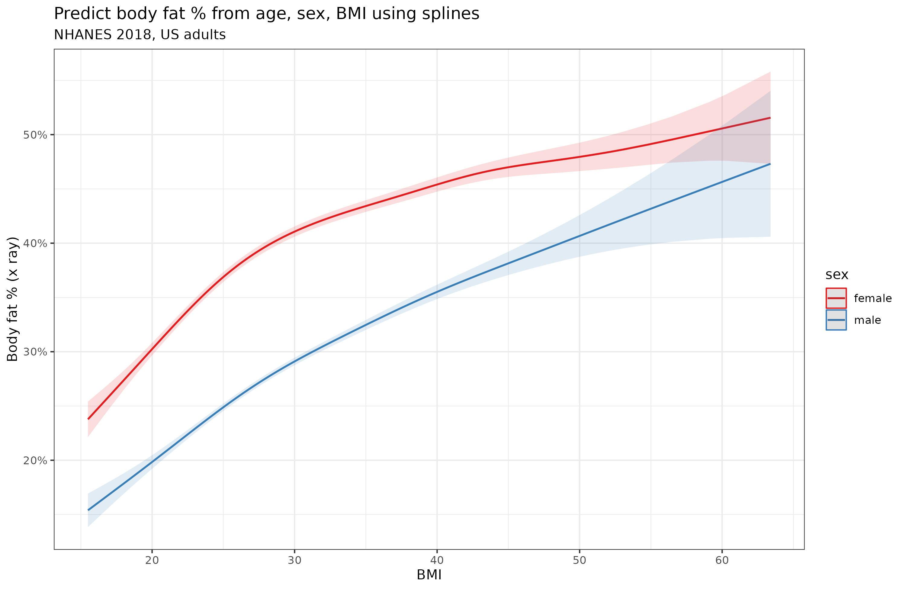
Granted, the degree of nonlinearity is quite small. A linear model using BF ~ BMI * sex + age explains 76.7% variance versus the spline model which explains 79.3%.
There is a better alternative to BMI, and you don't even need a scale for it. It's the waist to height ratio. Does it have the same nonlinearity issue?

It looks slightly more linear to me, but still has some nonlinearity, especially for women. Again, this was not entirely due to age confounding:
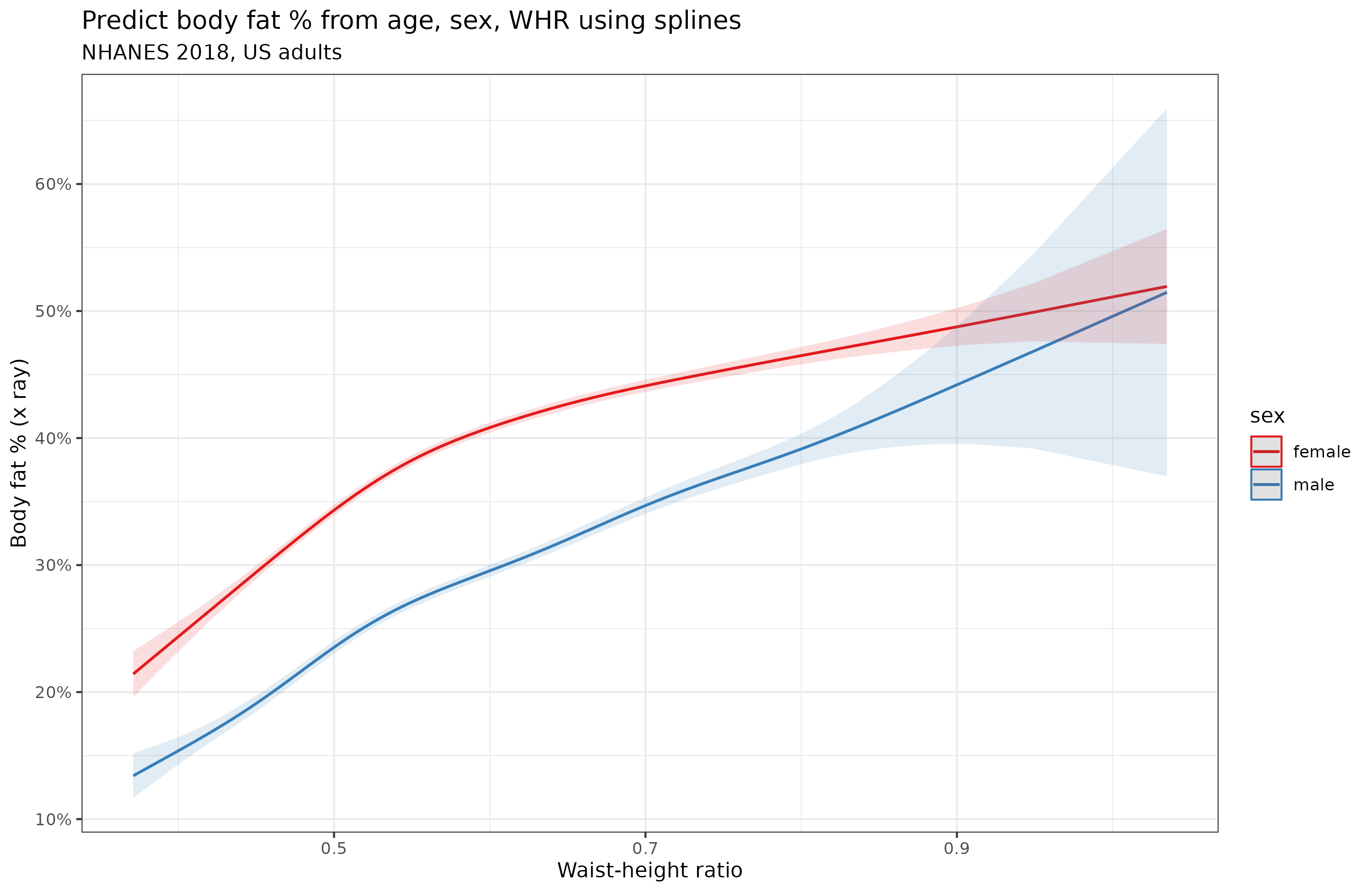
As much other research has found, the waist-height ratio (WHR) was a bit better as a predictor on its own, the correlations were 0.84 for men and 0.78 for women, the linear model achieved 80.5% variance explained and the spline 83.1%. Biologically, the male approximation should be higher because women vary in the size of their fat-based secondary sexual characteristics (breasts, butts) which contribute to body fat % but not to either height or waist.
So why the nonlinear relationship? I think it fundamentally has to do with the nature of body fat %. Since this is a percentage and bounded by 0 to 100%, any variable predicting it must necessarily show some nonlinearity for the more extreme values (approaching either limit). In this dataset, the upper observed limit was about 50% body fat, and the lower was about 13% (men) and 22% (women). The highest body fat % subject was a 32 year old woman weighing 104 kg, 152 cm, BMI 45.
Cohort differences in BMI and obesity rates
While we are at the topic of fat metrics, let's talk about this common claim that obesity started increasing in 1980 (or some other year):

Obesity here is just defined as BMI >= 30. Thus, it is a dichotomization of the BMI distribution. However, the relationship between a threshold proportion and a normal distribution is nonlinear, Cremieux did a thread on this recently. To see this, let's first simulate some normally distributed data that is similar to BMI in men (mean = 29.4, SD = 6.5), and vary the mean from 22.5 towards 50:
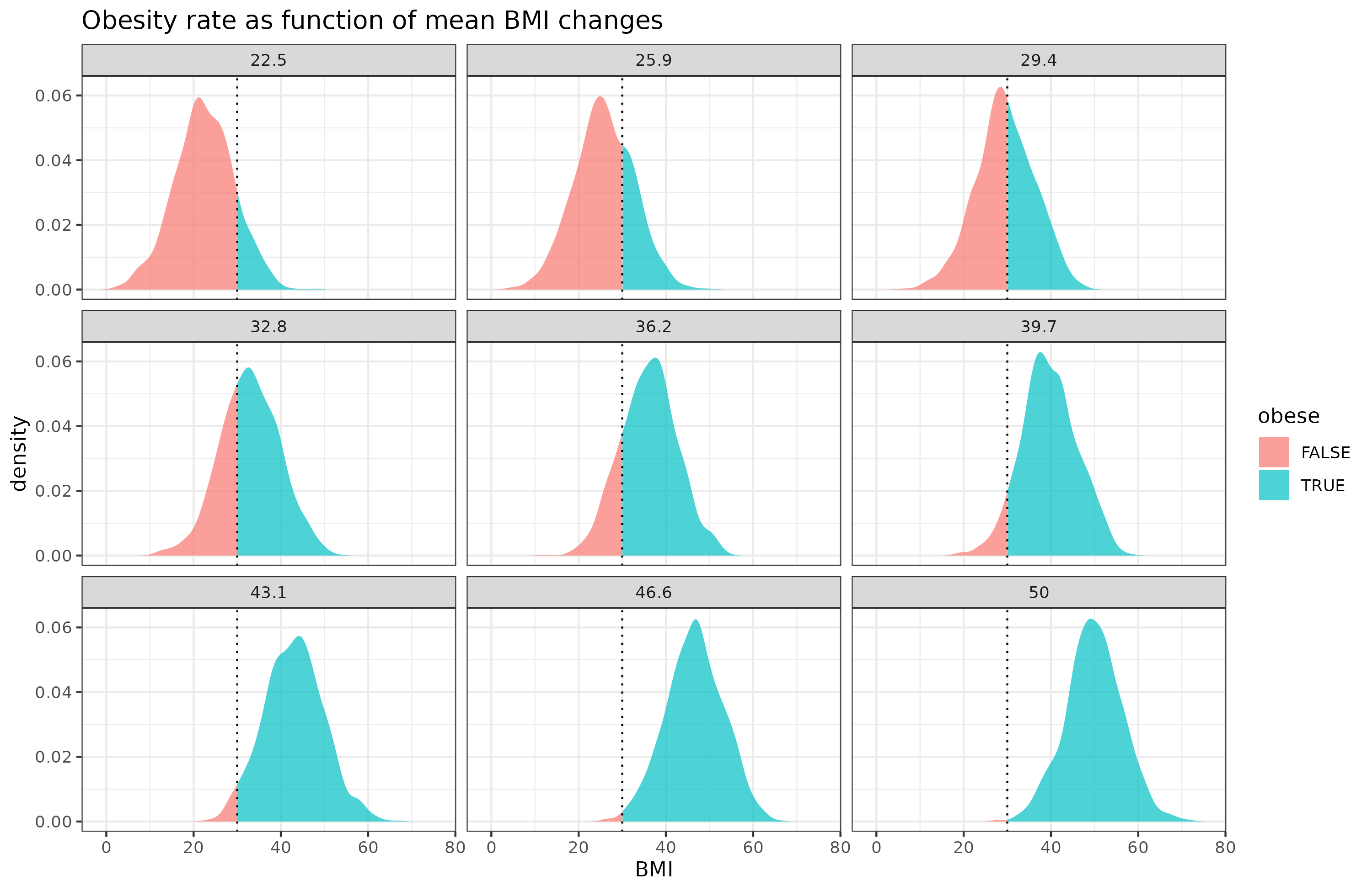
Due to threshold, the change in the obese % does not increase linearly as a function of the mean change in BMI. Here's just those values:
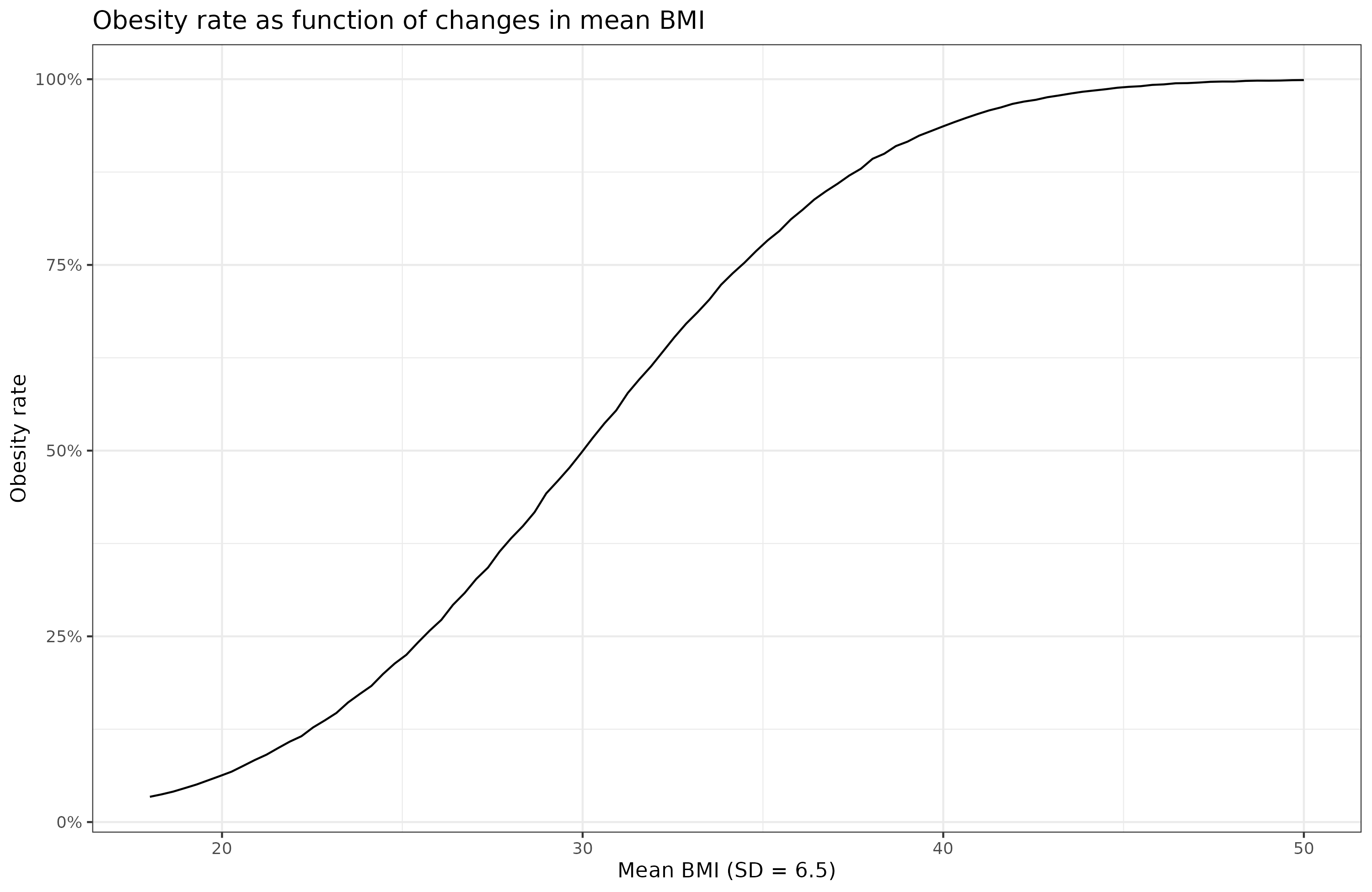
The change is greatest when the mean is around 30 (the current value!). In reality, though, the standard deviation is not constant, but also increases:
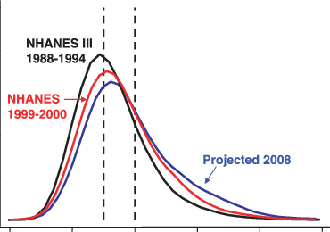
BMI data is available for many years in NHANES, but the data older than 2000 have very annoying formats unfortunately, so I didn't have time at present to analyze them. Here's the 2000 vs. 2018 data:

Notice the 2018 distribution is flatter. The mean BMI increased from 28.5 to 30.1, and the SD from 6.6 to 7.8. Both of these changes affect the obesity rate, which changed from 33% to 43%. The combined effects of the nonlinearity of the thresholding, and the changes in both means and SDs is why the obesity rate spikes at some point, apparently around 1980. This is a statistical artifact of the data transformation and does not indicate that something of particular interest happened in 1980 (seed oils or whatever). The rate of change in the BMI distribution was relatively stable across the years:

In this old dataset of students, we see that heights increased steadily (the height 'Flynn effect'), and weights started increasing around 1900 due to wealth and modernity. This figure has summary statistics (stanines, but they call them deciles) across many birth years:

The top line is the top 1/9th of the population's BMI. Notice that the top line diverges from the others over time, that's because of the increase in the right tail of BMI. The middle line shows the median, average White guys's BMI. It changes relatively linearly over time. The deviation from linearity perhaps being due to data artifacts or measurement variation. In any case, we see the astonishing result that for those age 50 both in 1880, the variation in BMI was relatively small. Not even the person in the top 1/9 was obese (BMI about 27.5). Judging from the divergence of the lines, it seems the variation in BMI more than doubled in those 100 years. No need to invoke special chemicals to explain the obesity 'spike' in 1980.
Why use a scaling factor of 2 in BMI?
BMI is simple, but you might wonder, why divide by squared height, instead of some other power? So I tried some other powers:

It turns out that using a scaling factor of 2.5 is optimal for women, and 2.3 for men. However, looking at the y axis, we see that it doesn't matter so much, and even a linear scaling (weight/height) would have been mostly fine.
But why divide by height at all?
OK, but why are we manually choosing the form of the height correction? Maybe we should just let a spline model figure out how to adjust weight for height. Here's the results:

It turns out this works about as well as BMI, and results in the same nonlinearity for women. In fact, it works slightly better than BMI: correlations with body fat % are 0.765 for women and 0.743 for men. For BMI they are 0.761 and 0.741. Some of this may be just the spline overfitting though. Recall though that waist-height ratio is quite a bit better: 0.782 for women and 0.835 for men.
Conclusions
Using x-ray data to measure body fat %, and various approximation of this using body measures, it seems that waist-height ratio is king. This aligns with the medical literature which has found that waist-height ratio predicts mortality better than BMI.
Incidentally, BMI works about as well for both sexes, slightly better for women than men. However, height-waist works better for men than women. Whatever objections to BMI based on body builders and broad shoulders, they don't seem to matter much in real data. Too few such people around to cause a noticeable discrepancy between the sexes.
BMI uses a scaling factor of 2, but in fact 2 seems suboptimal, the better values are 2.3 for men and 2.5 for women. The differences are slight though.
The approximations of body fat % are all somewhat nonlinear, mainly for women. This is not due to other confounding factors like age, or even race (not shown above). Some of this may just be inherently the result of body fat % being a 0-100% bounded variable, which ideally would require beta regression.
In a detour, we looked at the changing rate of gains in the obesity rate. Since this is a threshold variable of the BMI distribution, and this distribution has been moving rightwards (increasing mean) and increasing its spread over time, a change in the rate of brain in obesity rate is expected. This is not something that is due to the introduction of some chemical. The changes over the cohorts are quite gradual.
> a change in the rate of brain in obesity rate is expected
lol
I think it is slightly confusing as to what this statistical phenomenon means in practice. If I understand, there are two interrelated points being made:
1. Because a normal distribution is thin at the tails and thick in the middle, it follows that the % of the curve which is to the right of a right-of-center threshold increases more than the mean itself when the mean shifts to the right.
Ok. So this means the percentage of arbitrarily defined "overweight" people (BMI > 30) increases faster than the average BMI of the average population. This is definitely an interesting observation, but it doesn't make the "increased obesity %" stat wrong in any way. The "BMI > 30" stat never purported to measure the population's average body fat or whatever.
You say the “BMI is a quite decent predictor, or proxy of, body fat %.” And it looks like BMI 30 = around 30% body fat for men. So the issue here should be whether this BMI 30+/30%+ body fat threshold is meaningful for health (or even aesthetic) outcomes? In other words, how does, say, all cause mortality scale with BMI? Maybe 30% body fat is an important inflection point. Or maybe it isn't and the health effects are just linear.
In other words, if the increase in bad health health effects scales at a non-linear rate that is the same or greater than the non-linear scaling of the >30% body fat metric, then it may be entirely appropriate and most accurate to define the "obesity epidemic" by this "arbitrary" metric.
2. If mean BMI has necessarily risen more slowly than the BMI > 30 threshold that has implications for dating the overall increase in BMI and looking for possible environmental causes.
Ok. That seems like an important point. But does that mean that the accelerated increase in the rate of individuals with BMI > 30 is unimportant?
I don't know much about physiology, but I could imagine that there might be some homeostasis effects that might self-regulate hunger and body fat so that population BMI should be "anchored" around some objective healthy level rather than just varying around an (unhealthy) population mean. Even from just 2000 to 2018 you note that the BMI curve is slouching to the right, indicating that the ratio of extreme fatties is accelerating, with a big increase in SD "from 6.6 to 7.8." (Which is seemingly being generated solely by the increase in the right tail of the BMI curve).
In other words, isn't that change in SD prima facie evidence of some real phenomenon that is disproportionately hitting the right tail of the curve? (Or is this a statistical artifact of how SD is calculate for a "normal" curve that isn't fully symmetrical around the mean?)
Anyway, I know you aren't purporting to "solve" the whole issue in this post. But it seems to me that the numbers don't necessarily support Cremieux's claim that the statistics somehow "debunk" the whole "obesity epidemic" narrative.