
GDP, yes, but GDP per what?
Per person? Worker? Work hours? Something more complicated?

Many free marketeers have an almost religious devotion to seeing GDP lines go up. The American subset of these are therefore quite happy when they see plots like this one (inflation adjusted, PPP):

Usually, the plot on the left is chosen. This makes USA look good compared to the usual competitors: the US GDP grew 125% since 1990, but Germany only 55%. But when you add the large fast-growth economies, India and China, it doesn't look so impressive. China grew almost 1600% and India 600%.
While these plots tell us about the total productive output produced inside those countries (assuming we accept all the usual GDP-metric assumptions), this doesn't tell us about GDP per person. The most obvious way to increase GDP growth is thus just to increase the population. Since most countries are unable to get their citizens to reproduce much more than captive pandas, the usual approach is immigration. So let's look at the same plots but dividing the numbers by the population size to get the typical GDP per capita:
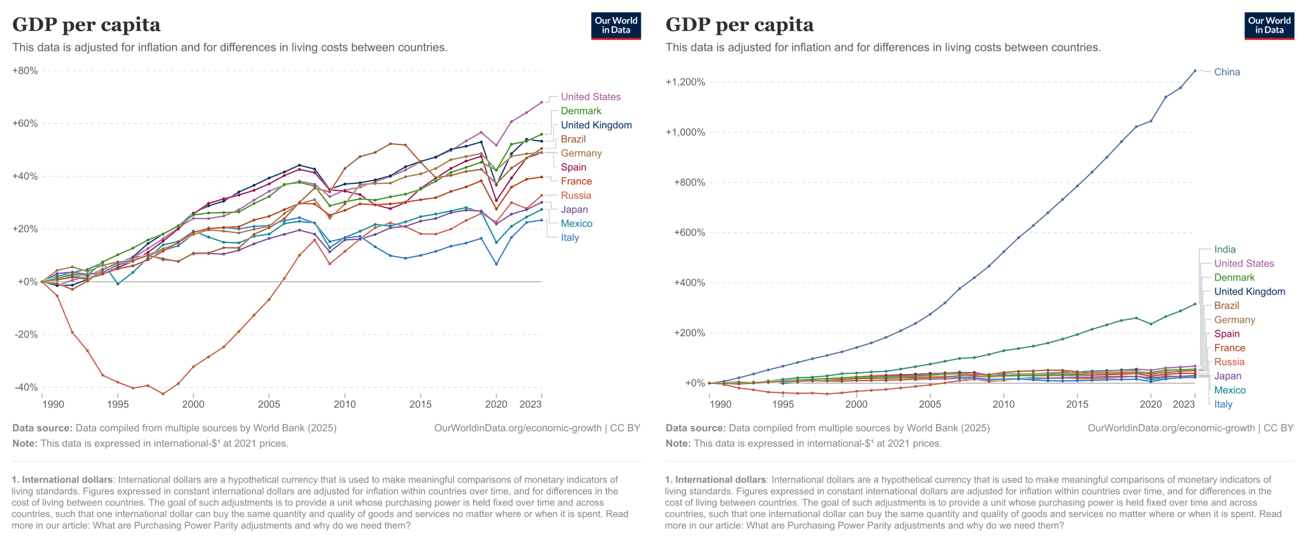
The American advantage has shrunk in the GDP per person version, though it is still number 1 in terms of growth. US growth is now about 70% since 1990, while Germany is about +50%. Evidently, some of the US GDP growth advantage just came from growing its population size. Adding India and China shows that they still have a very large growth that isn't related to population growth, though the growth for China was reduced from 1600% to 1250% and India from 600% to 315%.
This GDP per person metric tells us how much wealth the country is generating inside its borders per person, but does not necessarily tell us about productivity per worker. That is because countries have different age compositions. We might imagine Evil-Workaholic-Country that only allows immigrants who are old enough to work, and expels any person from the country who doesn't work. As a result, 100% of their population is working while the numbers are much lower for other countries. EWC thus looks very good in the GDP per capita statistics, all else equal. The simplest way to deal with this age composition issue is to divide not by the number of persons in a country, but by the number of working persons. Doing so gives us this:
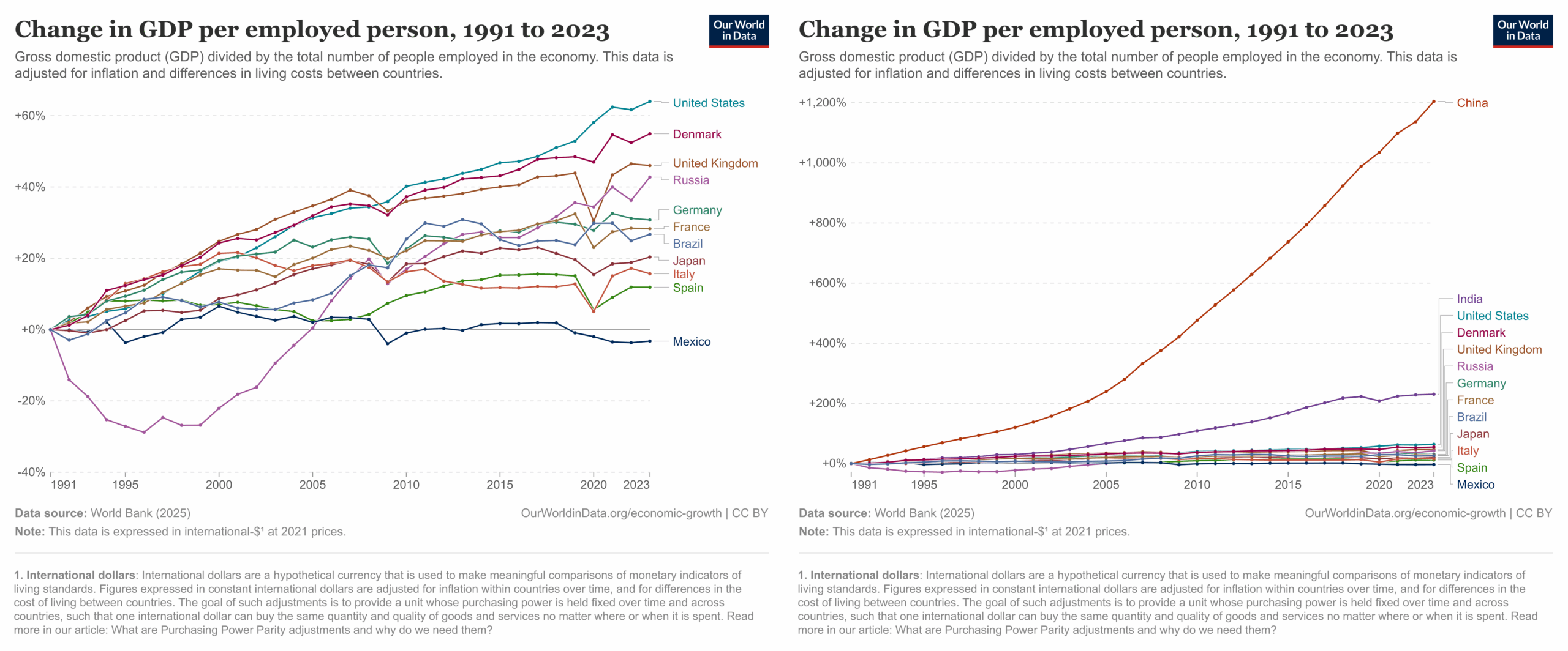
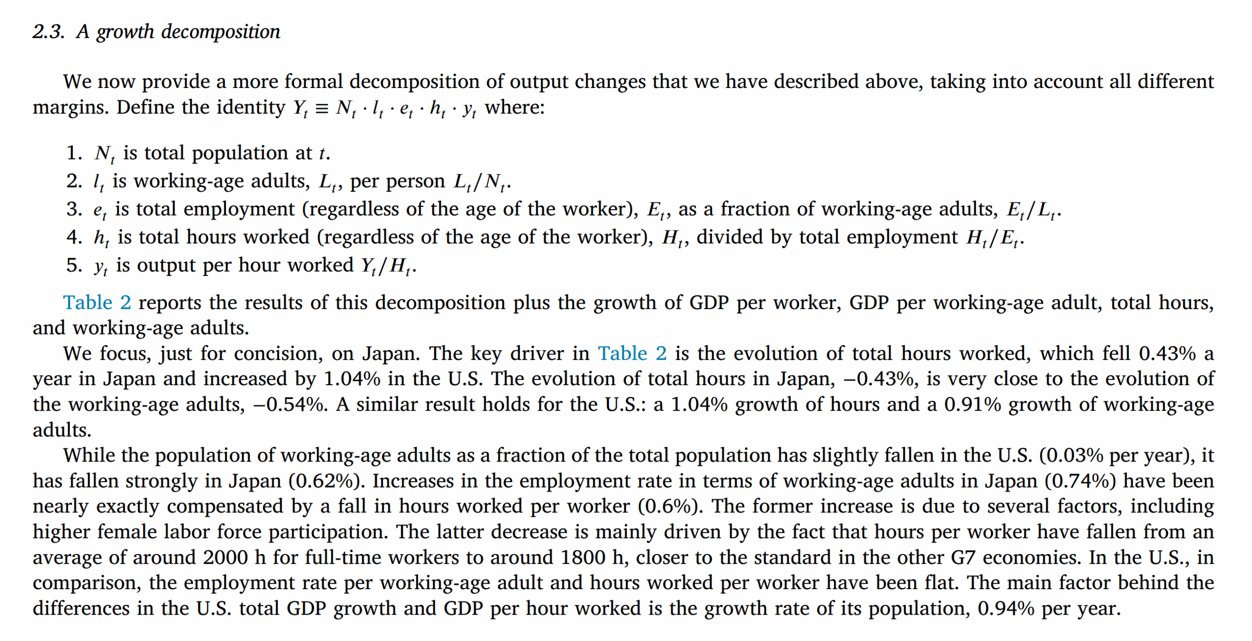
The USA is still ahead, Mexico appears to have no actual growth in productivity since 1990. India's growth has shrunk further to 230% from 315%, but China is still at 1200%. A team of economists led by Jesús Fernández-Villaverde had the same idea, but did this better. The plot above uses people employed, but this mixes together two metrics, those of working age (often defined as 15-64 though actually it differs by country too) and the employment rate. We might be interested in both of these independently. JFV broke this down into further components:
They did their own plots which look like this:

They were chiefly interested in Japan's lackluster economic growth. However, it turns out to be easily explainable in terms of population aging. The top-right figure shows the working age proportion of the population. This has declined in all of these countries, but especially so in Japan. If one looks at GDP growth per working age population, Japan is actually doing fine. There was never anything wrong with Japanese productivity per worker, only the number of workers relative to non-workers. Italy is still lagging behind though.
However, there is another refinement one could make. People don't work the same number of hours by country. In general, it seems that as countries get wealthy, they prefer having less money and more free time:

There is a downward slope in general, but also a lot of variation. Americans work a lot more than the European countries, which probably accounts for some of their extra wealth. JFV try this adjustment as well:

They note that the quality of hours worked data is poor, so caution interpretation. However, if we go ahead anyway, we see that the adjustment put USA again in the lead (which is odd given the figure above showing that Americans work a lot; maybe this has to do with those working not in the age 15-64 group). The main other change is that Spain joins Italy in the low-growth club.
The authors don't go further than this with regards to dealing with age composition. However, for those familiar with crime rates, we should immediately recognize that using the proportion of people between 15-64 is insufficient. Crime rates are much higher around age 20 than age 50, so it matters a lot what the distribution of age is within this range. The same is maybe true for economic productivity. We can use average income per age, perhaps, to convince ourselves of this:

The prior models assume that the income/productivity values are identical for the age groups within the 15-64 range. Again, here, Evil-Workaholic-Country could update its policy, so that only people between age 45-65 are allowed to stay, the most productive people (according to income). Using these empirical values, it is possible to adjust for a more granular effect of age. To do this, we need to choose a reference population, say USA in 1990. Then calculate its proportion of people in these age brackets, and their relative incomes. Then one can take the age composition of each other country and compute the differences between their age compositions in the same brackets and obtain a correction factor. To see how this works, let's use the example from my 2017 study of crime rates in Germany:

Before presenting the analyses of the full Danish data, we present simplified examples of the proposed method.7 The method relies upon the assumption that the age-crime relationship is constant across human populations. That is, while one population may be more criminal than another, the relative risk of crime between age brackets is constant. E.g. that 1519 year olds commit 5 times as many crimes as 70-79 year olds in all populations. If this assumption can be made, then one can adjust for age without having age information about crime rates, as long as one has this about the population. Table 3 shows basic crime data for the Danish population along with relative risk in relation to the youngest age group. The source of the data will be explained in Section 5.
The overall crime rate can be found simply by calculating the dot product of the population and crime rate columns and is .032. One can also compare specific age brackets. For instance, 15-19 years olds are about 5.44 times as criminal as 70-79 year olds according to these data (1/.184).
Consider now a hypothetical population that by age is just as criminal as the Danish population, but happens to have more young persons. Table 4 shows the numbers for this population.
We see that this population has quite a few more young persons, and thus an overall higher crime rate of .039. In relative terms, this is 1.21 the Danish rate. To calculate the adjustment factor to use, one calculates what the crime rate would have been if this population had the same age-related crime rates as the Danish population, and divides this value by the Danish crime rate. In this example, this value is also 1.21. We then divide the observed crime rate or the relative risk by the same value and obtain a value of 1.00. In other words, we find that this population is exactly as criminal as the Danish population when age has been taken into account. This is of course what we had assumed in this scenario.
Table 5 shows another hypothetical population. As can be seen, this population has as many young persons as that before, but the age-related crime rates are also higher. The total crime rate for this population is .077, or 2.41 times the Danish overall rate. How much of this increase is due to the different population structure and how much is due to the higher age-related crime rate? We calculate what the total crime rate would have been given the population structure and the Danish crime rates, and then divide this value by the Danish total crime rate. This gives us a value of 1.21. Thus, to get the adjusted total rate, we divide the observed rate by the adjustment factor which gives 2.00 (2.41/1.21). Thus, after taking age into account, this population is twice as criminal as the Danish population, a fact which can also quickly be verified by noticing that the crime rates are exactly twice as large for each age group compared to the Danish ones.
These examples may seem trivial, but the point is that this method can be used when one does not know the crime rate by age brackets for the subgroup. One only needs to know these for the total or host population, and be able to make the assumption that the crime-age relationship is approximately the same across groups.
If we could find income data for the specific age groups, this method could be used to almost fully adjust between time and country data for age differences. However, the plot above and others like it have issues because they don't use a proper age cutoff. Most 65+ year olds do not work, so the data are based on those that work and report taxes (it seems). So I am going to have to cheat make strong assumptions. I'm going to ignore the below 18 category and the 65+ category and just use the ones in between. I am also going to ignore the 18-19 year olds because the data data concern 5-year groups. With that in mind, I downloaded the UN population age distribution data from here. Assuming I did the coding correctly (and that copilot did its part correctly), the age-income based correction factors look like this:
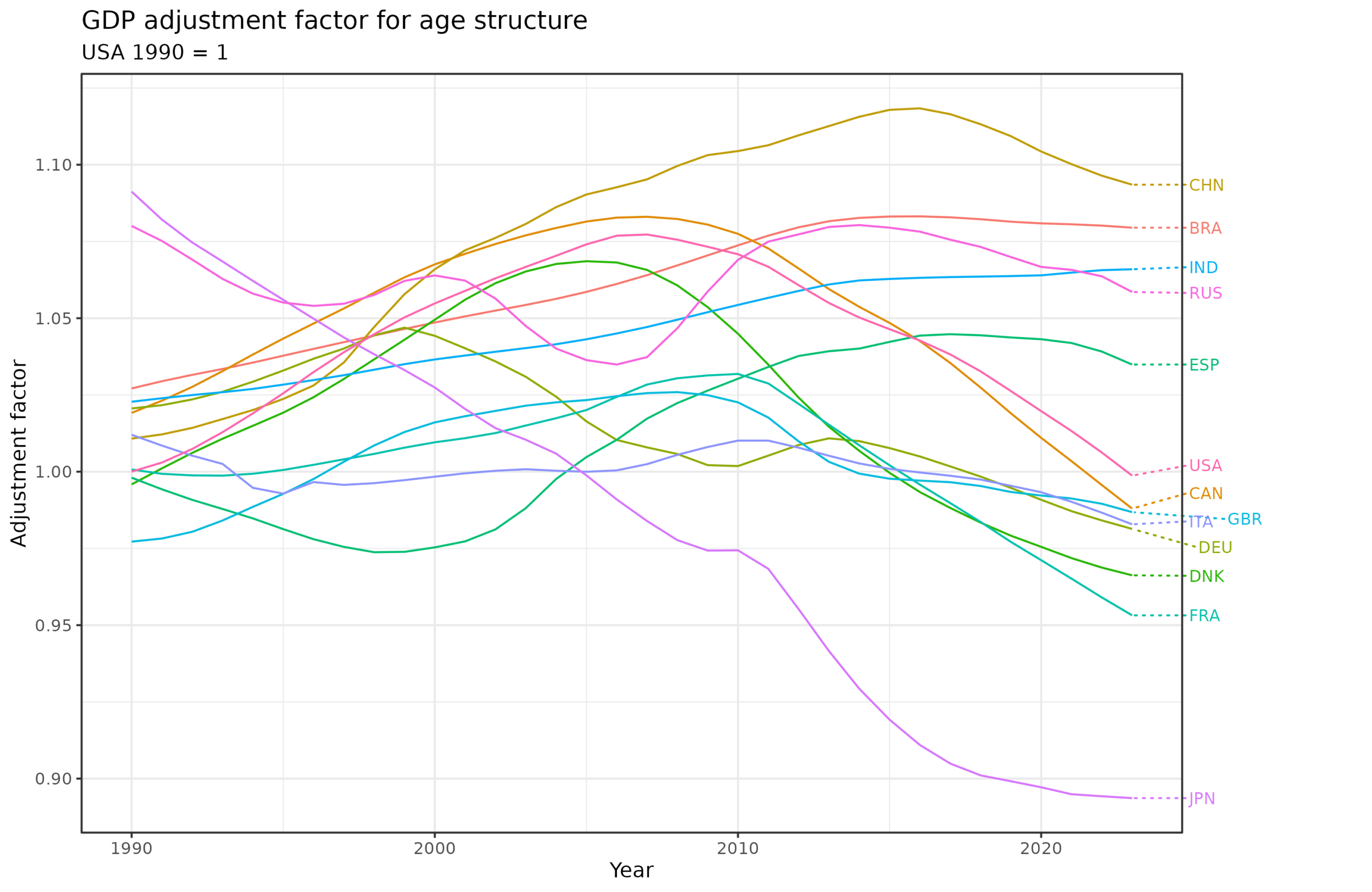
The correction factor has been scaled so that USA in 1990 = 1. In other words, this is the number one needs to divide the GDP by to adjust the age distribution to be equal to that of USA in 1990 based on the assumed contributions to GDP based on the income by age group we saw above. Curiously, USA has seen an improvement over time in their age distribution (larger adjustment factor), but it has declined to where it began (that is, 1). Japan has seen the largest decline in the optimal age distribution, with its factor declining from 1.09 to 0.89. China has mostly seen an improvement over time, but it too started declining in 2016.
Finally, we can use apply the correction factors to the GDP per person data and see the economic growth over time adjusted more fully for age effects:

It turns out the advanced age adjustment factor does not matter much for China, either way its index increase to about 1250. It does matter to Japan, which grew to 130 without age adjustment and 159 with. USA is still the growth king among established countries, but not by so much once we look at per person and age-productivity adjusted data.
The take-away
We saw that countries can grow their GDP most easily by increasing the population size, mainly by immigration. For this reason, it makes more sense to look at GDP per person assuming one is interested in wealth generation per person. However, the age distribution matters here too, since children and retirees do not contribute much. Using the relatively crude method of looking at the working age population explains Japan's relatively lackluster economic growth rate, but not Italy's. Using the more advanced methods of GDP per working hours or per productivity weighted population size didn't alter these conclusions. We can also note that Russian economic growth is rather unimpressive, near the level of Italy. This does not bode well for Russia's aspirations to be a superpower in the future.
One can attack these results based on multiple objections. First, it is somewhat doubtful that one can proxy economic growth contribution using incomes. A lot of innovation happens in earlier ages, and the older workers have structural advantages related to how companies reward years of service. Maybe the 50 year olds get paid twice the amount the 25 year olds do, but it is doubtful they are twice as productive, or even more productive at all.
Second, age composition and working hours are not nature-given but themselves related to policy. Insofar as one wants to grow the economy it is wise to set policy to achieve good metrics in these areas, while also balancing working life with private life. The adjustments can also be silly. If some country decided to reduce work hours by 99%, this would leave their GDP per hour worked unaffected (assuming linearity!), but would markedly impoverish the country. From this perspective, it is more sensible to look at GDP per working age person, perhaps scaled in some kind of way by productivity as done above.
Finally, the above numbers have the usual issues with non-human capital affecting the GDPs. Russia's economy is much more based on limited, natural resource extraction than most of the other countries: 19% of Russian GDP is from natural resources, 10% for Norway, 1.3% for USA, 0.3% for Denmark, and 0.03% for Japan:

This doesn't matter if one is interested in total GDP because money is money that can be used to pay for more military. But it does matter if one is taking the various GDP per person/worker/hour as a measure of worker productivity. As such, Russia productivity is lower than GDP numbers suggest, even with these various age related corrections.
This is an excellent point; using the actual working population to calculate per capita GDP provides important insight into understanding trends, especially with regard to Japan. That said, you might want to consider applying this to productive GDP instead of merely GDP calculated at purchasing power parity (PPP). Productive GDP excludes services; not because services are unimportant, but because they are much harder to effectively value, and often include very dubious components like imputed rental value or mandatory insurance.
We published an extensive article in June 2023 about why this measurement is more meaningful; it's here: https://austrianchina.substack.com/p/chinas-shocking-worldwide-economic.
One of these days we will publish some updated calculations based on the latest numbers, but the situation has not changed much.
This is looking at immigration in a way that is too uncharitable. A poor Mexican comes to the US. Then you say he brings the US GDP per capita down. But it doesn’t make Americans who were already here poorer. You might even want to judge his income relative to what it is in Mexico and get growth from that. Poor immigrants can bring GDP per capita down but make natives better off by moving them up into more productive jobs like in management roles. So America bringing in a lot of immigrants and growing more per capita is quite impressive.