
How to norm a score
Heteroscedas what?

Suppose you have created a new scale of something (”Science Blog Rating Scale”). It can be psychology or some other soft science, but it doesn’t have to be. Suppose you want this scale to have a comparable scoring across age groups. Ideally, subjects and researchers should be able to look up at given raw score for a given age and get a centile and z-score back. The old approach to accomplishing this is to group people into age groups, and administer the scale to a number of people from each age group. Given the large differences that are seen during childhood, this gets expensive quickly. For instance, the latest version of the adult Wechsler sampled:
The adult portion of the WAIS-5 standardization sample was used for the present study, a diverse nationally representative sample of adults across the 20–90-year lifespan. Specifically, 180 participants comprised each age group for individuals aged 20–24 through 85–90 (n = 1660), which mapped 11 different age groups.
Since administering this battery takes maybe an hour or more, and you need to do this in-person, and Pearson also had to find representative people willing to participate and pay them for this, this norming method probably cost millions of dollars.
Can we do better? Well, yes. We can do statistical norming. If we can figure out the function of age on the raw score, we can do just a single mixed age large sample and interpolate the exact values, and we don’t have to worry about finding 180 representative 85-90 year olds.
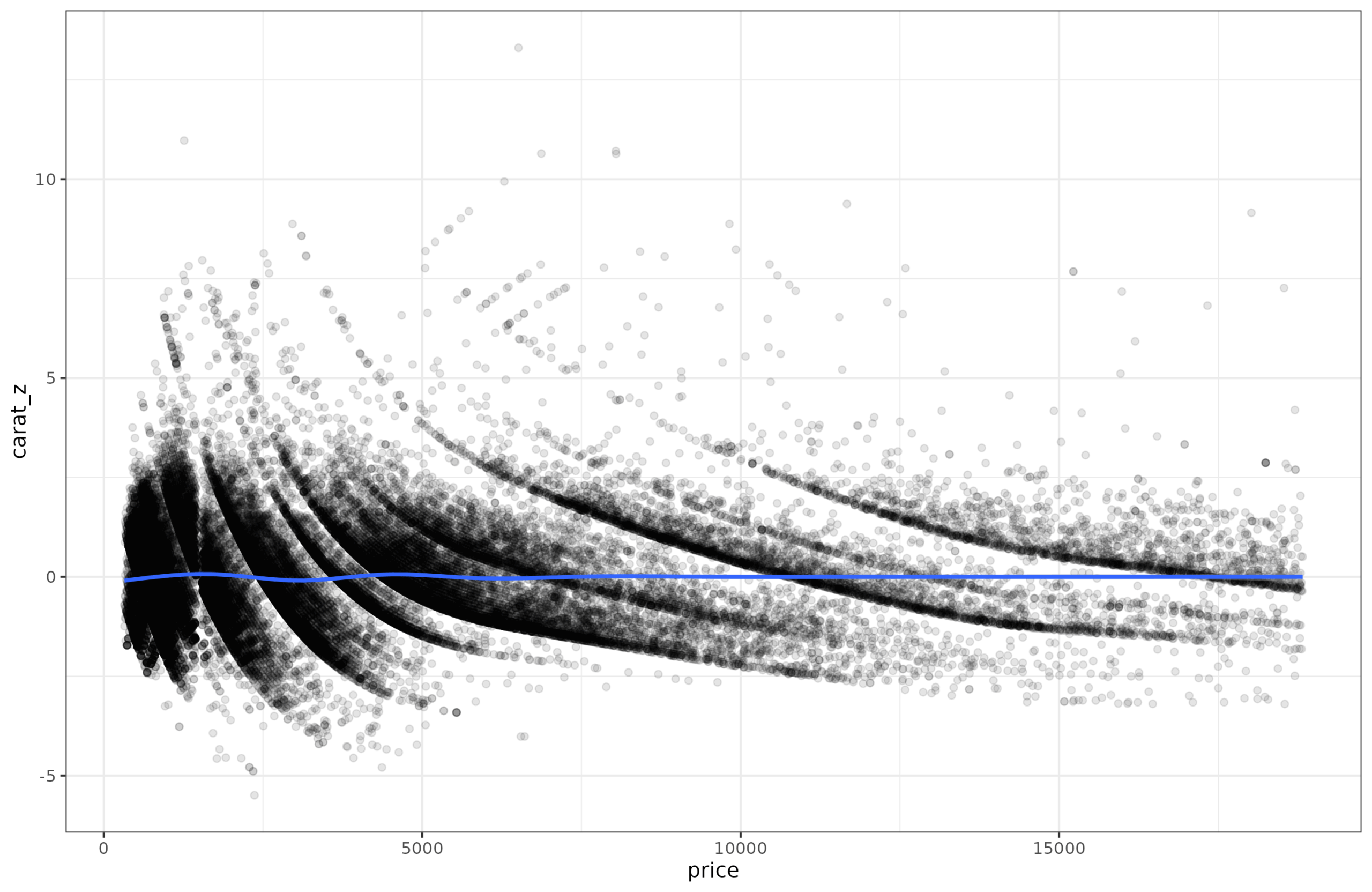
Let’s go over some example data. For reasons known only to yourself, imagine that you are looking at carats of diamonds as a function of their price. This isn’t really a psychological scale, but that doesn’t matter for the math. (In fact, since carat is a mass (200mg), I have inadvertently managed to make a scale pun!) If you plot the relationship it looks like this:
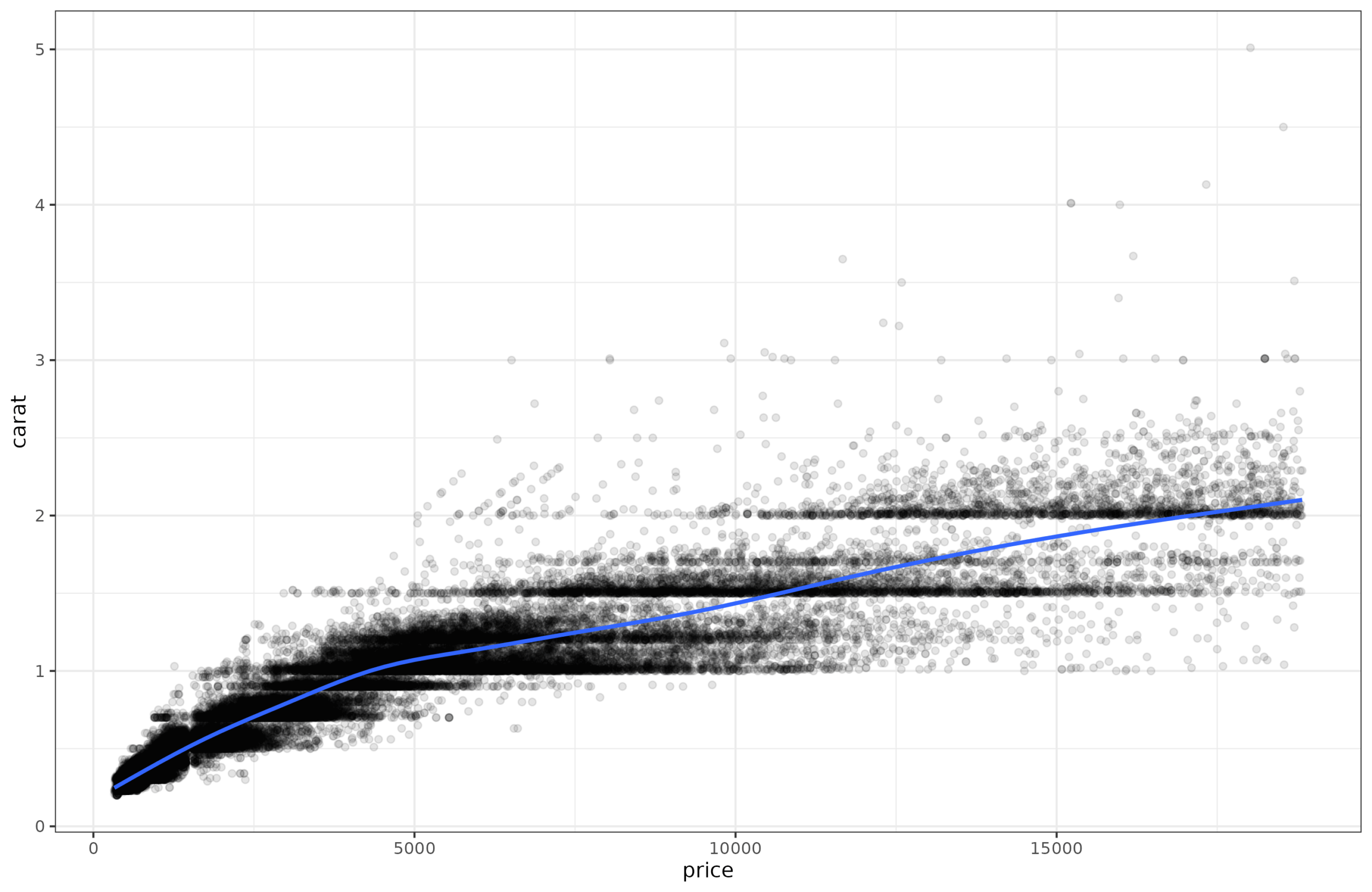
The linear relationship is pretty good, r = 0.92. However, looking at the line, it appears the points further to the right in the plot are more spread out around the regression line. In other words, for ‘cheap’ diamonds, we can predict the carat (the weight) of the diamond very well, but for expensive diamonds, we can’t predict the weight so well. Perhaps because the price also depends on other factors other than size and thus weight (color, clarity, shape etc.).
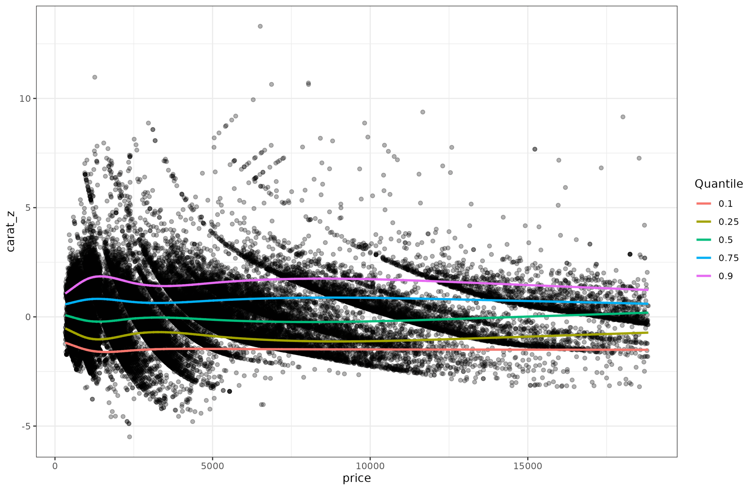
One way to confirm this hunch is to do quantile regression. Regular regression is really means regression, that is, you try to predict the mean (expected) value given some variables in the equation. But we don’t have to limit ourselves to that, we can also try to predict the distribution, as captured by the centiles. Quantile regression to the same data above shows this:
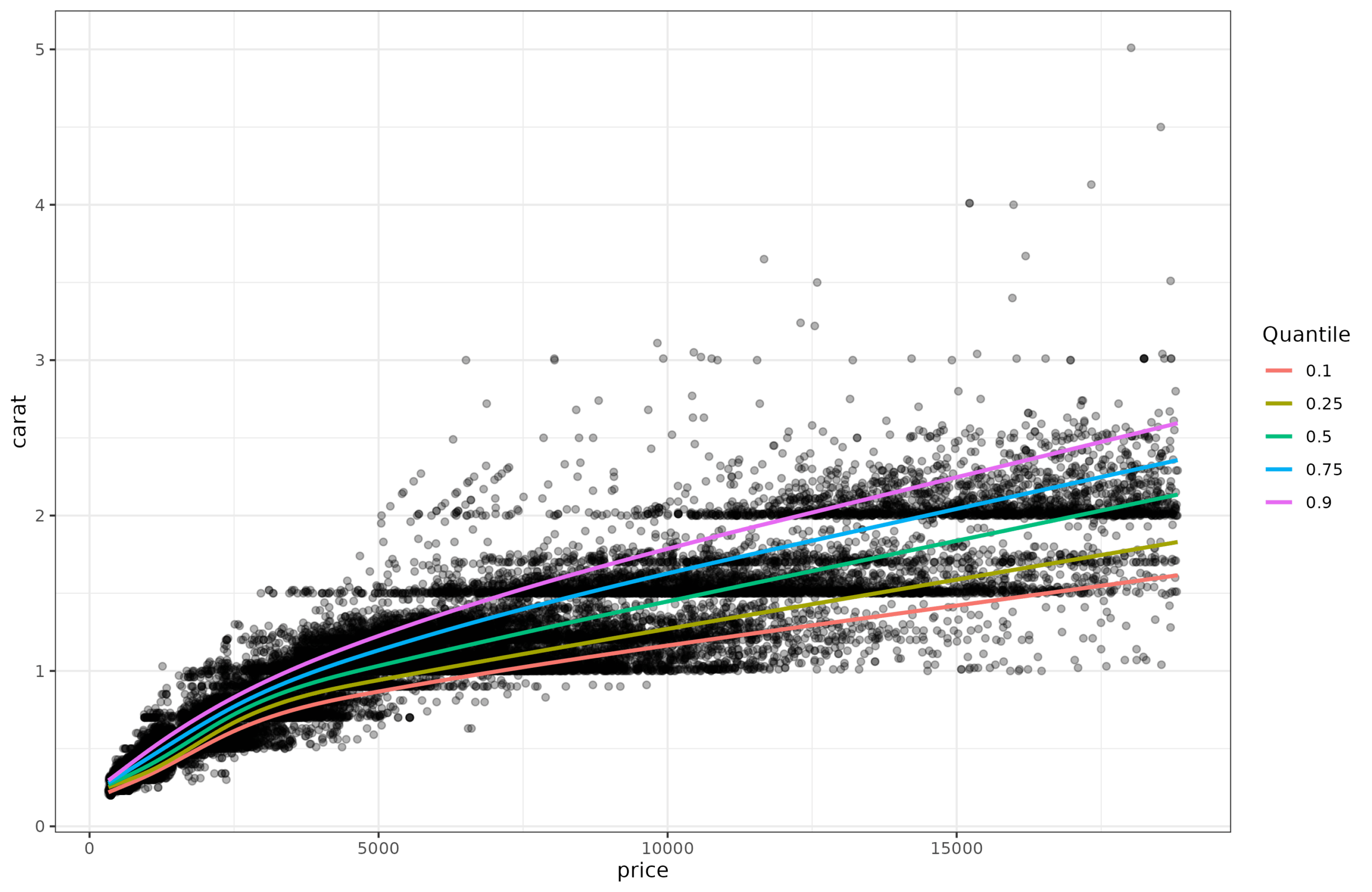
And here we can easily see that the lines get further apart as the price goes up. This non-constant dispersion is called heteroscedasticity (a very annoying word to say, try it a few times). There are some standard statistical tests for testing for this. I tried them out but found they were brittle, so I implemented my own variants. It’s easy to show how it works. First, you fit regular (means) regression to the data (carat~price), and save the residuals. Since the pattern is a bit nonlinear, I fit a spline (gam) model. It obtained adj. R2=90%, which is equivalent to r = 0.95, and thus as expected slightly better than the linear model (r = 0.92). Anyway, we save the residuals and plot them:
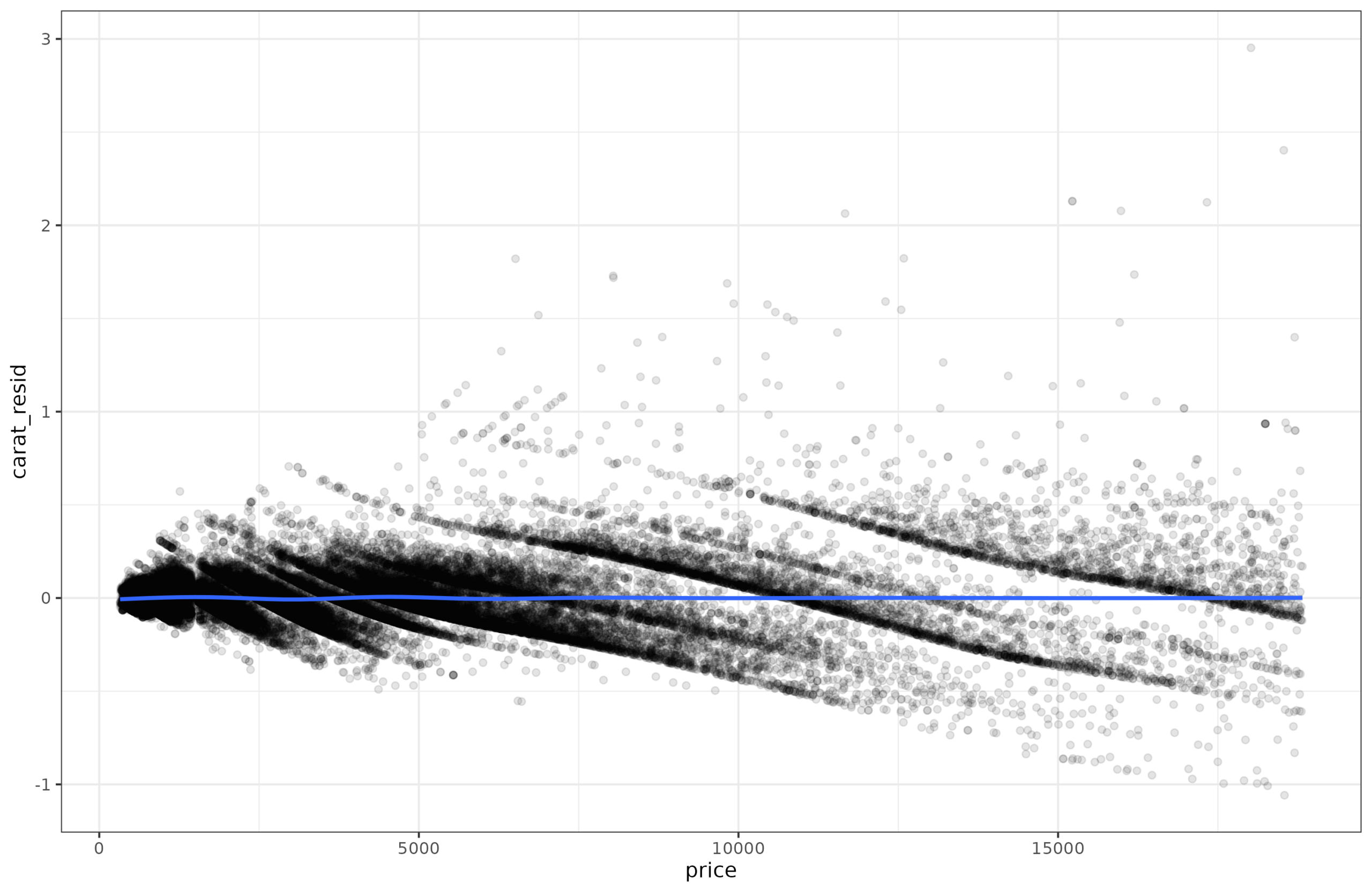
OK, there is no longer any trend for the mean (flat blue line), and we can see that the dispersion of residuals grows as a function of the price. Is there some way to detect this mathematically? Well, one simple idea is to square the values, to make them all non-negative. Predicting these squared residuals with the price in a regression constitutes a test, since any detectable non-zero slope would suggest heteroscedasticity is present. If a spline model was used instead, non-linear heteroscedasticity could also be detected.
I did some limited testing years ago, and it is better to use absolute values than squared values. Squared values create extreme outliers which cause false positives when normality is violated even to a slight degree. Better is to convert the data to ranks too (akin to Spearman correlation), which avoids most of the issues with outliers. And then fit the regression model tests. In my simulations, this approach achieves a quite good distribution of p-values:
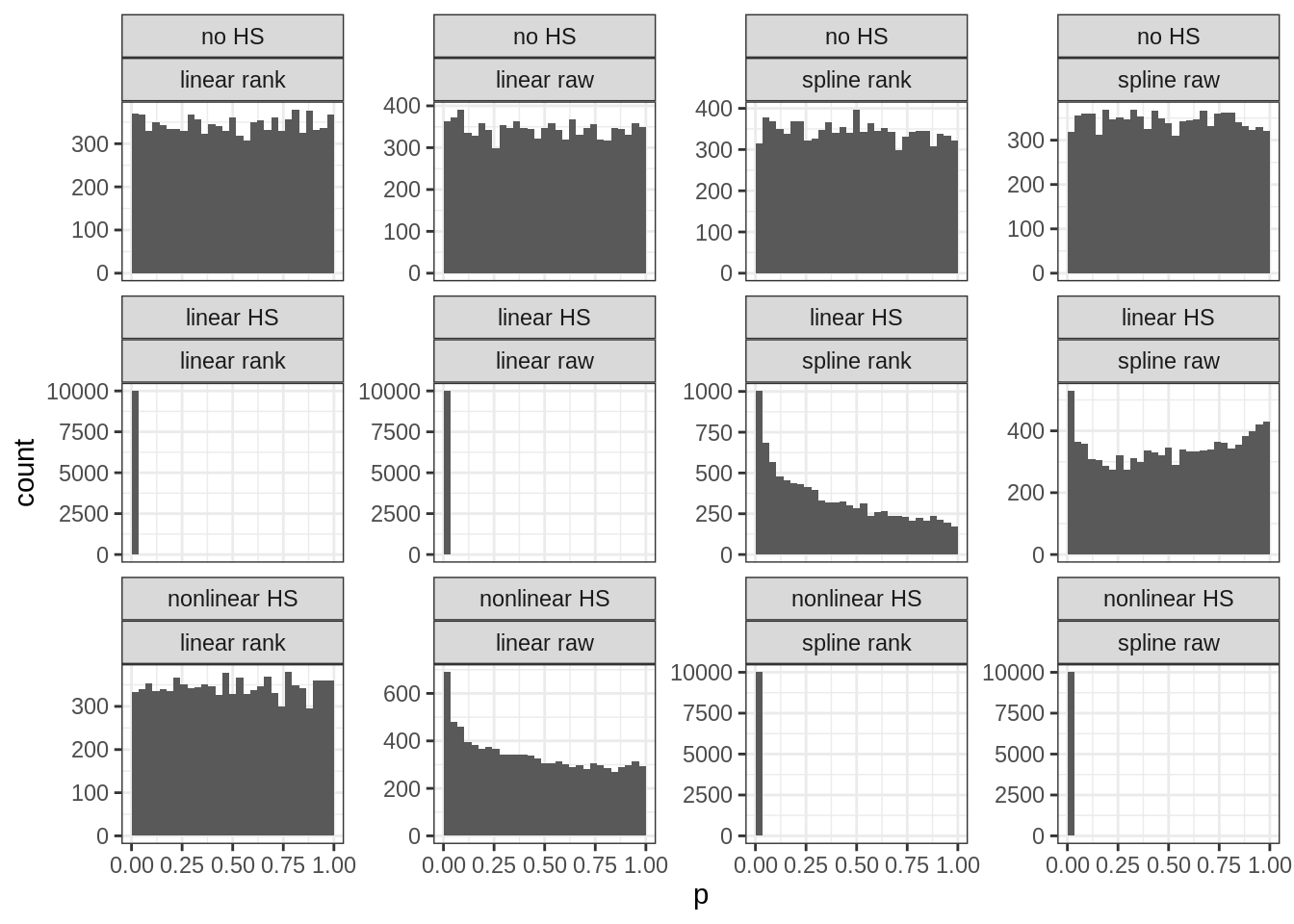
The rows are: No/linear/nonlinear heteroscedasticity in the simulated data. Columns are: 4 methods variants to detect heteroscedasticity. Each subplot shows the p-values from many replications of simulated data. This distribution should be uniform when there is no signal as in plots in the top row (a uniform distribution implies that the chance of finding a p-value below 5% is in fact 5% and not higher or lower). The distribution should be moved towards the left when there is signal (statistical power), with clear examples in row 2, column 1-2, and row 3, column 3-4 (power ~100% with these sample sizes). However, the model comparison fails a bit so that spline tests sometimes detect false nonlinearity (row 2, columns 3-4).
OK, so we have discovered the heteroscedasticity in the diamonds data, but how do we get rid of out? It turns out it is very simple too. Just fit a new regression model to predict the absolute values of the residuals from the first model, same as when we do the testing for heteroscedasticity. Then divide the residual from the first model by the predicted value from the second model. The values have now been scaled but kept their direction and relative values. We can plot them to be sure:
The data aren’t pretty given the strange lines in the data but the spread around the blue line has been made close to constant. In fact, if we run the heteroscedasticity tests before and harder this procedure, we find that:
Before: models explains about ~30% variance in the residuals, slightly more for spline models.
After: models explain ~0.3% of variance in the residuals. The p values are small, but the effect size is now trivial.
Alright, so those norms? Well, let’s look at the quantiles of these double-corrected values:
Thus, we can see that the quantiles are more or less constant now as a function of price. The heteroscedasticity has been almost entirely removed. The data can then to be set to the usual z-score scale, or IQ-scale, or SAT-scale or PISA-scale etc.
The modeling approach here is, however, the reverse of what one typically wants to do. Here, we spent a while figuring out how to completely remove the effect of price on carat so that we can make the distribution around the mean have constant variance, which thus allows one to interpret values easily as comparable z-scores. In real life, one usually begins with a particular score and age (say carat 1.00 and price of 6910 USD) and asks whether this is a good or bad size diamond for this price. Plugging these two values into the models we just went through results in a value of -1.112 z, in other words, 13.3rd centile. It is relatively light diamond for the price. If you go back to the second plot (the one with quantiles and original variables), and eye-ball the location of price=6910, carat=10, you can see it is close to the red line, which shows the 10th centile.
Anyway, I used the diamonds example because the dataset is cool and has a lot of data. Here’s a realistic example from one of our studies (A New, Open Source English Vocabulary Test). The scored vocabulary test (226 items) and age have this relationship:
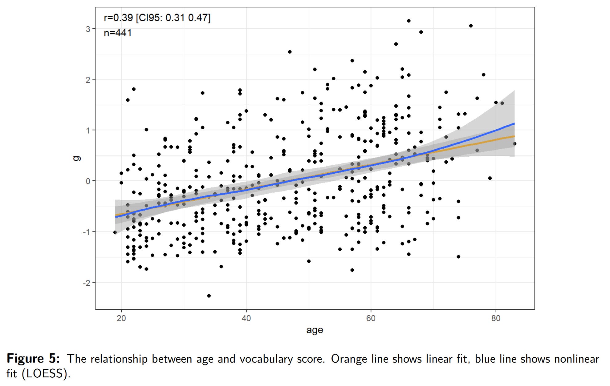
There is a moderate linear positive relationship (r = .39), and also an increase in the variance with age (though slight and hard to visually see). This is the same problem as with the diamonds data but here we cannot just subset the data into small age bands to fix things because we only have 441 cases (the diamonds dataset is 54k). Here’s the quantile regression plot of the vocab scores, not given in our paper (we used histograms with 3 age groups):
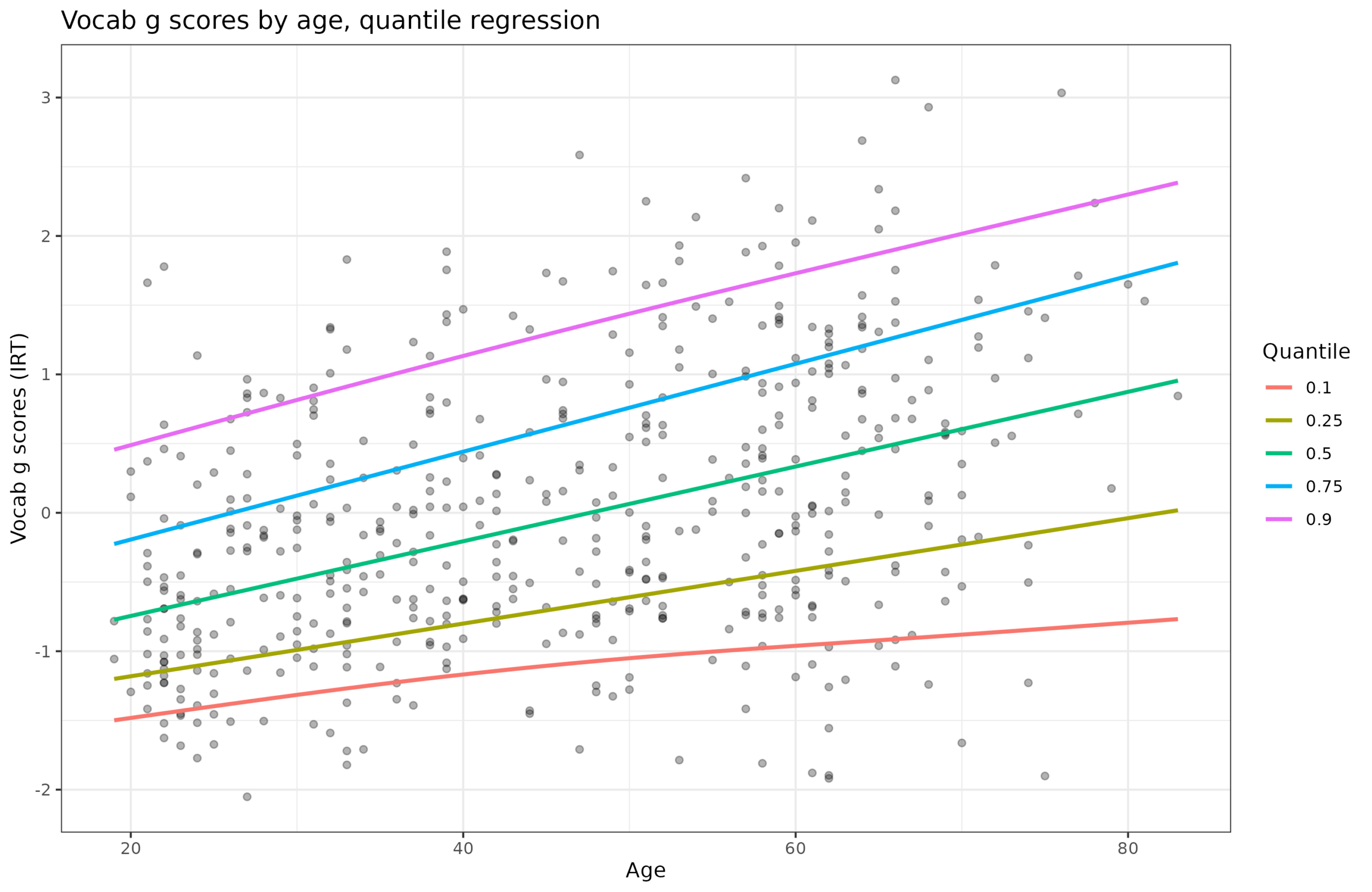
The increasing spread of the quantiles confirm the heteroscedasticity. I wrote a function that inputs any score and age and automatically applies the decision making I discussed above to the data. That is:
Corrects for a linear effect of age on mean score. If present.
Corrects for a linear effect of age on variance of score. If present.
Optionally uses a subset of the sample to compute norms for (e.g. Whites in mixed race sample).
Outputs the scaled scores, intermediate scores, and the summary statistics and models needed to apply these to any other datapoint.
There is a sister function that inputs a such norm object and a [score, age] combination and gives you the corrected score. So let’s pretend someone took the vocabulary test above, and their IRT score was -1 but they are only 20 years old. Normally, a -1 score means 15.9th centile, or IQ of 85. However, given the variance is not constant, this is a bit off. There is in fact no 20-year old in the dataset with a score of -1, so we can’t just look up a real case (we can’t even insert a such case and use the remaining 20 year olds because there are only 3 20-year olds!). We can however apply the statistical approach. Doing so reveals the proper IQ is 92, not 85.
This the benefits of this approach is not limited to saving money when making norming samples for this or that scale. It can also be used to normalize a variable by any set of continuous and discrete variables. One could easily include sex in the models if one wanted to remove any potential sex difference in final scores (this is the same as using separate norms). One can in fact also use this method on polygenic scores to normalize them by ancestry dimensions (principal components) or ancestry proportions (admixture). This removes the need to discretely classify people for the purpose of simple adjustment (usually based on self-reported races). The resulting ancestry-adjusted polygenic scores will follow the standard normal distribution with mean 0 and standard deviation 1 regardless of what ancestry mix the person has. This approach is the explicit, or more commonly implicit, version of the blank slate for race in genomics, since it removes any ancestry differences in average polygenic score. Using the resulting scores as predictors would give substantially biased predictions insofar as the ancestry means match up with reality (real genetic differences in risk). For instance, Africans have higher polygenic scores for schizophrenia, and also have higher rates of this mental disorder. If some epidemiological study used schizophrenia polygenic score adjusted for ancestry this way, it would fail to incorporate the knowledge about the group means into the model, and thus that validity would be assigned to something else in the model, probably self-reported race.
R code here. The diamonds data is built into R (tidyverse). The English vocabulary dataset you can find in the OSF repo for that study.
Would it be enough to run the regressions for just the P25 and P75 to visually test? If there's any systematically changing variance, these (or even one of them) should be enough to highlight? And if it shows up at, say, the P90 but not the P75, is it really an issue?
Data analytical magik.