
More COVID vaccines, less excess deaths worldwide
Total boomer tech victory

Back in the days of COVID, there was a lot of debate about the efficacy of the vaccines. Unfortunately, most randomized trials were cut-short or too small to look at the actual mortality reduction effects, and instead used the proxy outcomes of detected infections, hospitalizations etc. This combined with the extreme government overreach in implementing anti-COVID measures (looking at you, forced masking!) understandably led to political opposition. The opposition often came with alternative theories of COVID, and especially various conspiracy theories regarding the vaccines.
Now that COVID is behind us and no one cares anymore, we can look at the 'final' data (we might get another wave, but I don't think so). First, the excess deaths per million:

The meaning of the map is counting how many people died between 2020 and end of 2023 compared to simple statistical models that predict that number based on pre-2020 data. Normally, it is fairly easy to predict death counts because it is highly dependable on population counts, ages, and seasonality. Finally, the excess death count is divided by 1M to adjust for country sizes. This is not perfect, but it is a decent metric.
Next, we have vaccine coverage:

This is simply the number of vaccine shots given per 100 persons. Maybe one should use instead % of people with at least 1 shot, or those with 'complete coverage' (1-2 depending on vaccine type). I think however this cruder metric will be fine and will also include whatever the effects of booster shots are.
If we plot these two variables, we should see different things depending on your priors:
If vaccines worked, there should be a negative relationship.
If vaccines were more harmful than beneficial, then it should be positive.
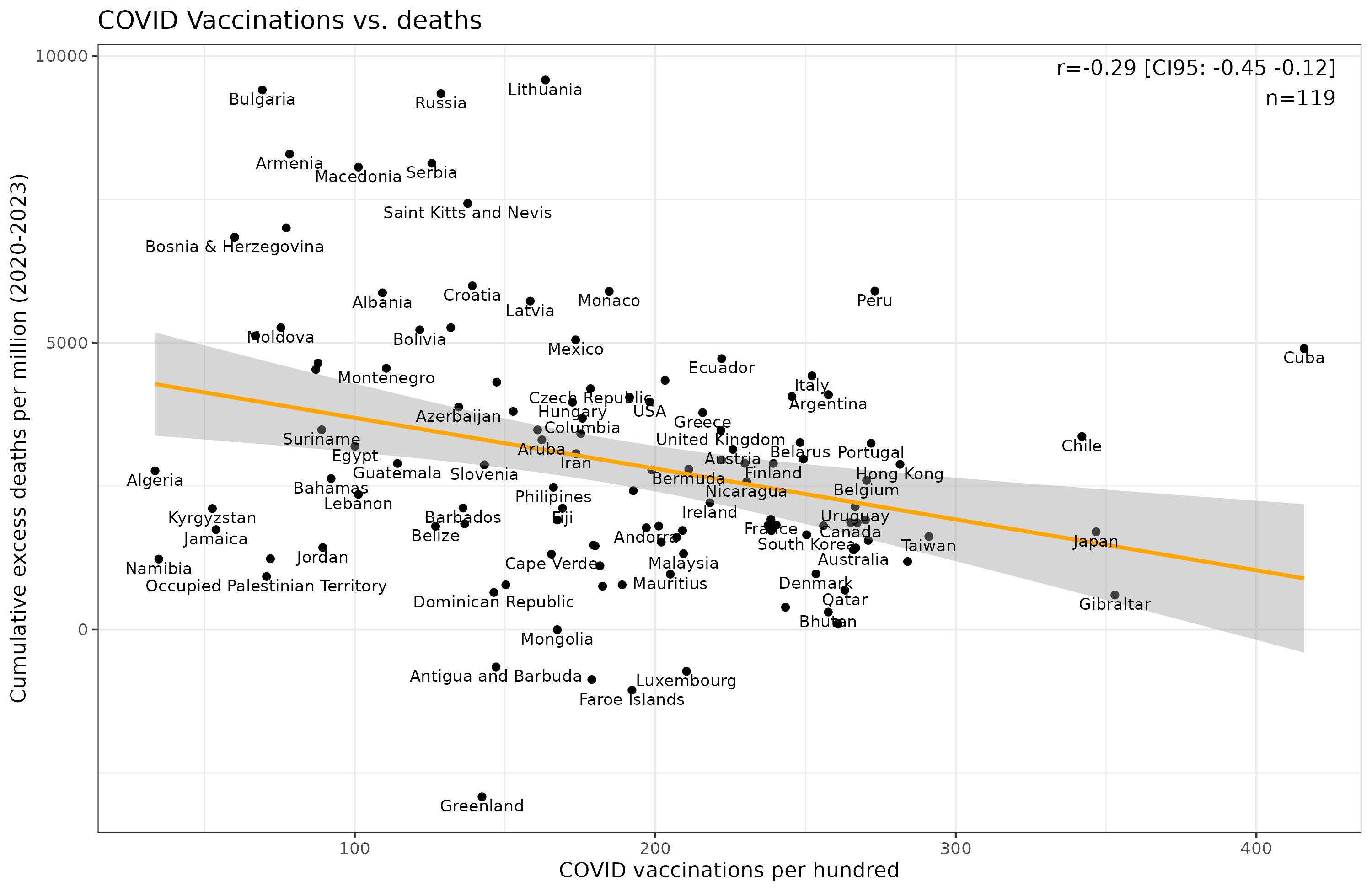
OK, so it's negative, but not impressively so, r = -0.29. But maybe there are confounding variables that obscure the real hypothetical causal relationship? So let's try adding some variables to see how this affects things.
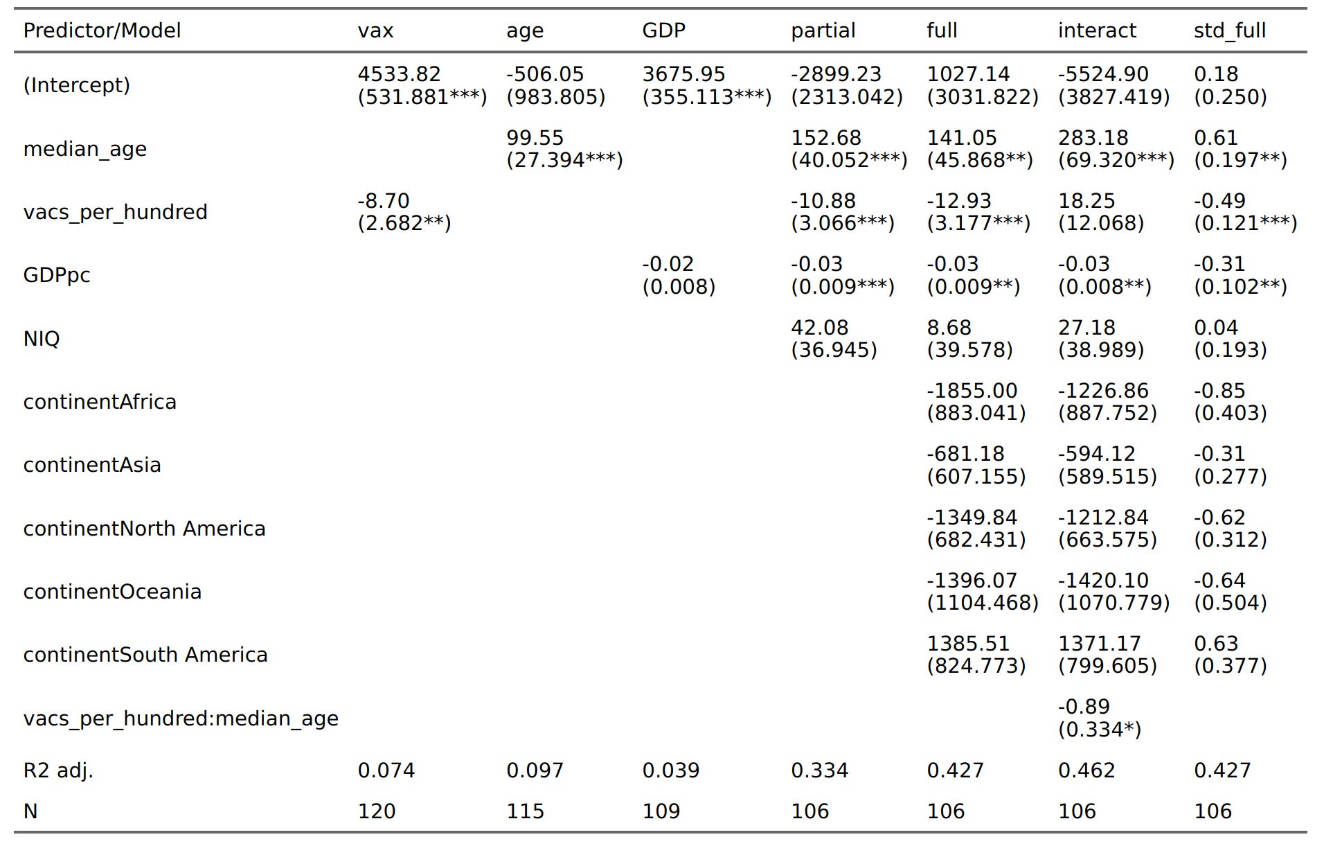
The units are in raw slopes, so the simple model tells us that an addition vaccine per 100 people is statistically linked to 8.7 fewer deaths per million in the period. If we add national IQs, GDP per capita, and median age, the vaccine effect increases to 10.9 (column "partial"). If we also add continent dummies, it increases to 12.9 ("full"). It seems the other variables were obscuring the benefits, at least statistically speaking. Finally, it makes causal sense that vaccines should interact with age because vaccinating people who are young won't have much effect as their mortality rates are very low to begin with. The model with the interaction shows ("interact") that this is the case (p = 0.009). It is best to plot interactions since the numbers are hard to understand alone:
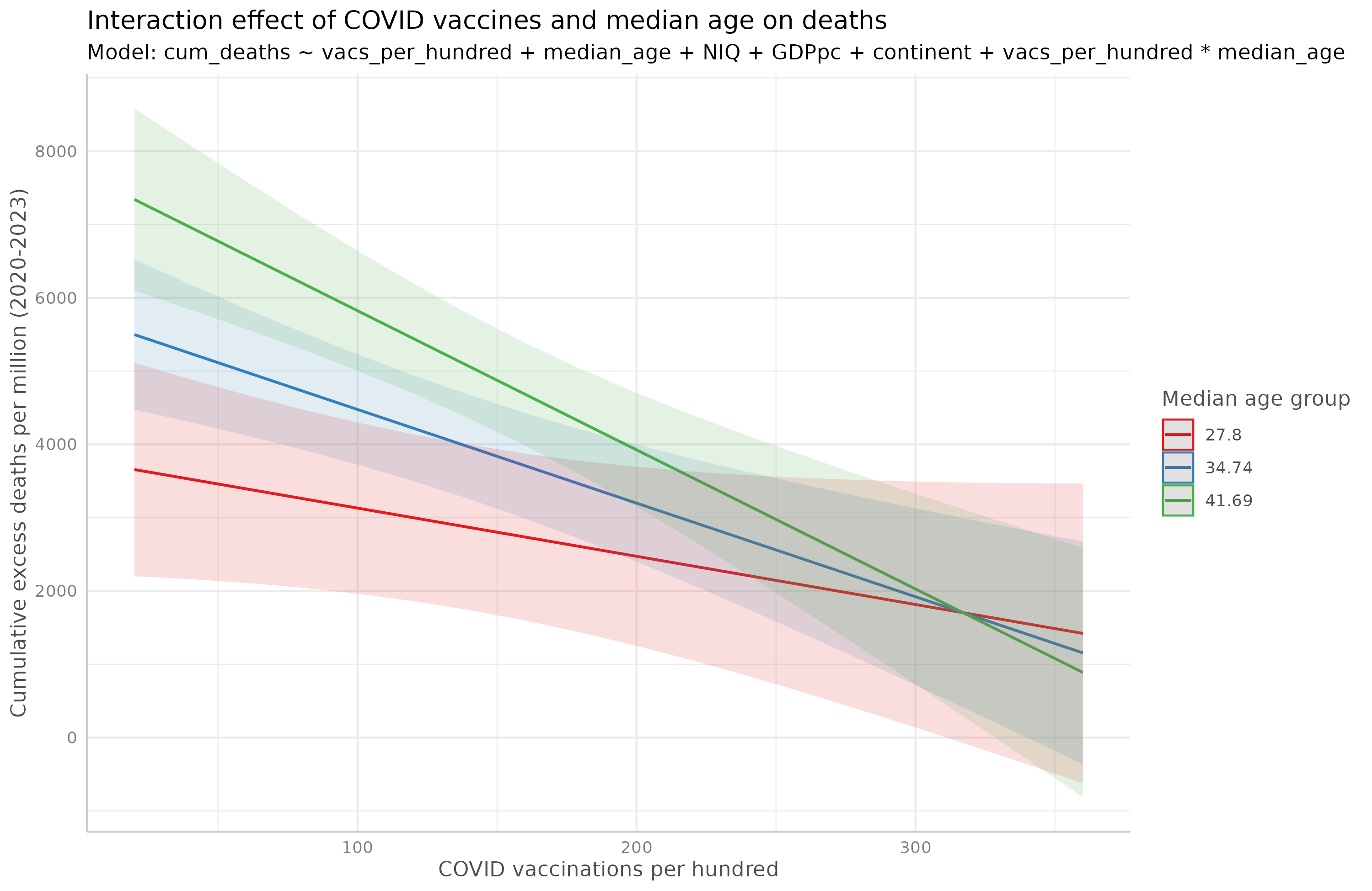
Thus, we see that the effect of vaccines is stronger for older populations (green line has a more negative slope). The model suggests that if one vaccinates like crazy (3+ per person, and since children don't usually get shots, this may mean 5+ for older adults), the mortality rate may reach parity with younger populations (convergence of lines on the right side). Total boomer and tech victory. The final column ("std_full") in the table shows the standardized effect sizes for easier comparison of predictors. In this we see that the effect of vaccines was nontrivial 0.49 in correlation metric. Median age was the strongest predictor 0.61, which is expected because COVID killed mainly old people. Having more money was also seemingly beneficial while IQ didn't help directly (see, even Emil can produce research showing IQ doesn't matter!). Overall, the full model with or without the interaction explained the worldwide COVID rate rates quite well, r about 0.65 (sqrt(0.43) and sqrt(0.46)).
The suppressor effects (vaccine effect is stronger when other variables are included) are because of positive correlations among the predictors which have opposite effects on the outcome. We can see this in the correlation matrix:
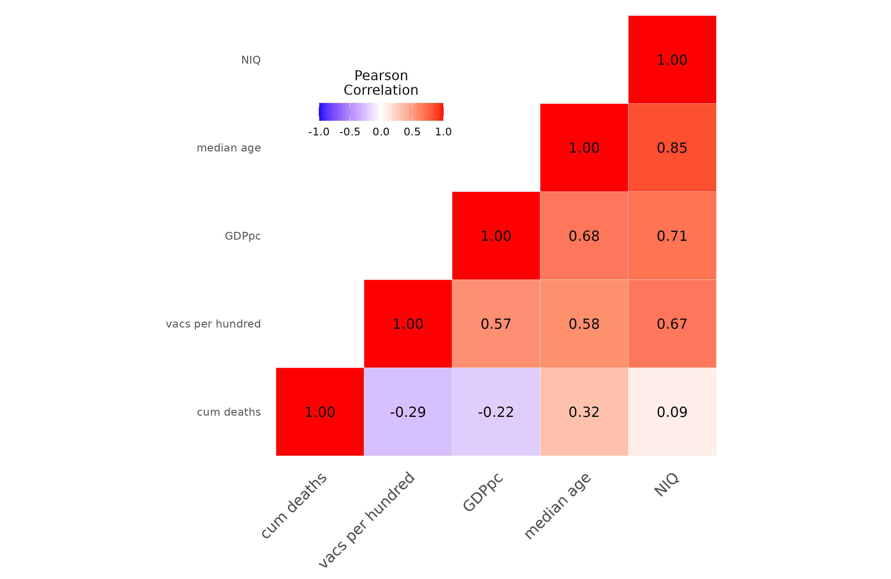
Vaccination rate predicts deaths negatively (-0.29), but has a strong positive correlation with median age (0.58) which predicts positively (0.32). The same is true for GDPpc.
The results above don't strictly prove causality from vaccines to fewer deaths, of course. However, if one wants to claim that the vaccines didn't work or were net harmful, one would have to come up with a list of plausible confounders that reverses the results.
Thanks for a different look at the efficacy of COVID-19 vaccines.
Substack has been flooded daily with articles to the contrary, whose authors, I feel, are using the narrative that COVID-19 vaccines are harmful to make money from those who believe everything is a conspiracy. You may well get some pushback.
A potential problem I see is something like a "healthy vaccine user bias". At least in a few countries that I know of, people who got more vaccines were significantly different than non users or people with less vaccines (more health conscious, higher socioeconomic status, ... ). A common finding with taking these things into account is a null finding for younger populations and a dampened advantage for older and other vulnerable populations (through still significant and absolutely enough to justify a recommendation).