
Race and social inequality in France
Deep dive into the French data

France is the 4th most populous country in Europe these days (it used to be number 1 before it had early secularization). It is also quite insular when it comes to data owing to their poor English and strong native language (about the same number of speakers as Arab, rank 5-6). This insularity is somewhat ironic given that English derives something like 50% of its words from French. Anyway, the point of the introduction here is just that we don’t know much about France from an HBD perspective, so I’ve tried to do something about it using public datasets for aggregate units. The normal issue with exploring the data from some foreign country is that I don’t speak the language and to some extent am not familiar with the kind of data that exist. However, AI solves the first issue and also makes it exceedingly easy to quickly build a massive database for analyses as well as implement the key models. So that’s what I’ve done.
First, we have to understand the structure of France from an administrative perspective since the available datasets will reflect this structure. France has 13 regions (level 1, US state equivalent), 101 departments (level 2, US county equivalent) and X communes (level 5):
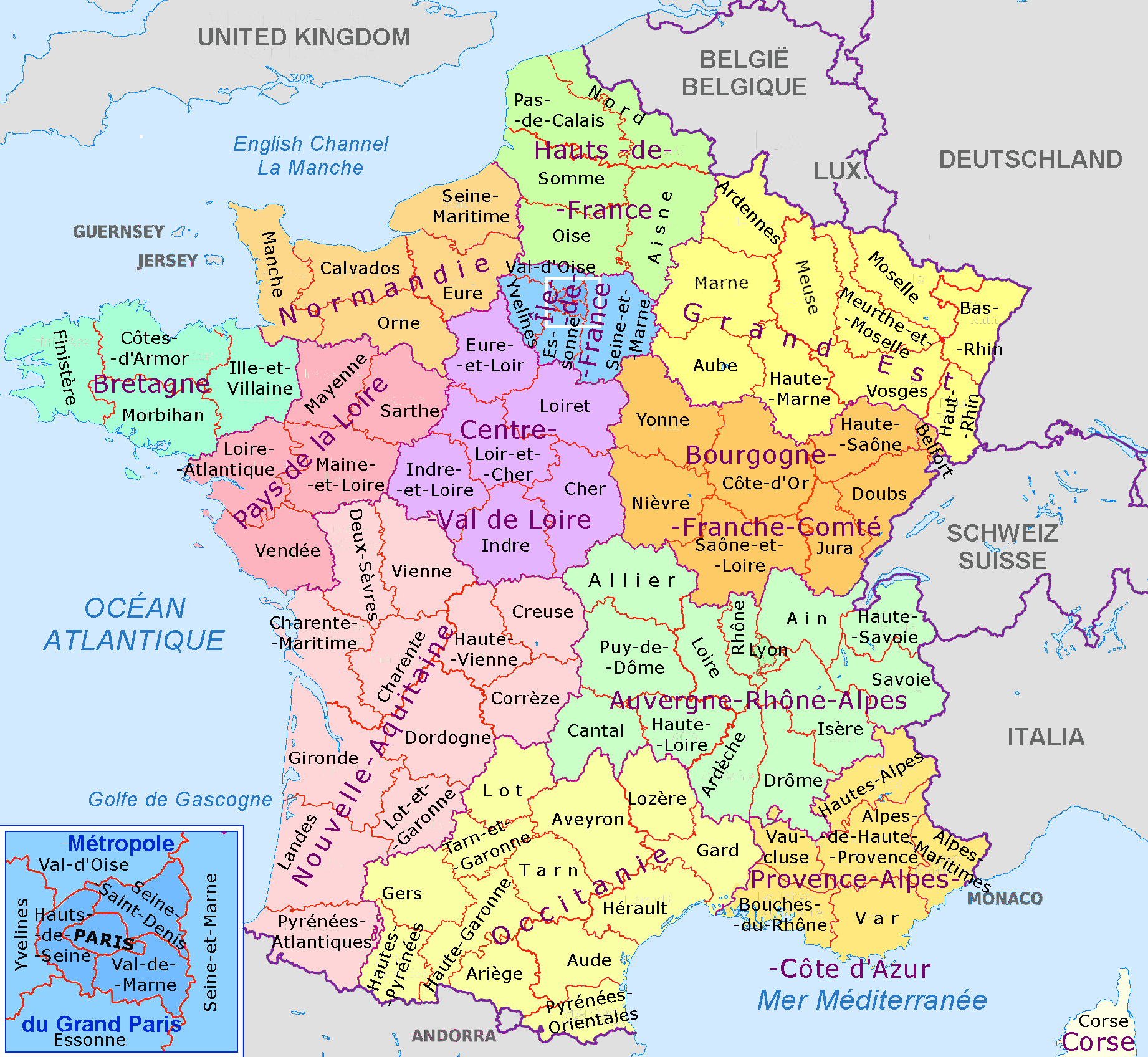
The communes are too numerous to usefully show but this map shows the regions of mainland France and their departments. Paris itself is split into 4 or 8 departments depending on how inclusive you are, which is good for us.
The next peculiar thing about France is that it has a law that makes it broadly illegal to collect ethnic/race and political/philosophical data. I know this sounds insane, and it is. It also sounds like a modern Woke invention but it is not, and also prevents them from complaining about inequality directly since they themselves cannot collect such data. Of course, when regulation is introduced, the market interprets this as cost of doing business and routes around it, and this is also true for the scientific market. Thus, a number of different approaches exist to counting the ongoing population replacement:
Foreign born % (also broken down by country or region of birth)
Foreign citizenship % (including categorization)
Sickle cell anemia testing of newborns
First name counting and classification
Counting mosques and Muslim businesses on the map
The government publishes data for 1-2 at various levels of granularity depending on the administrative level, that is, most fine-grained for the national situation and less precise for the lower levels. Sickle cell anemia is a clever workaround because the law stipulated that newborns should be offered genetic testing if at least one parent is from an at-risk ethnic background, and thus indirectly this tells us about which fraction of babies are born to such people (apparently not violating the law against ethnic data). More or less every culture has distinctive names, and while this is more true for last names, first names are also alright. Muslims really like Mohammed and very frequently give that name to their sons. Muslim names are much more clustered around a few popular names than other cultures which makes counting Muslims using first names easier. Finally, using various open map data or company listings, one can count the density of Muslim related organizations. The combination of these various methods thus give us a quite good idea about what is going on in France despite the direct ban on the data collection. The names% approach is how people post stuff like this on Reddit:
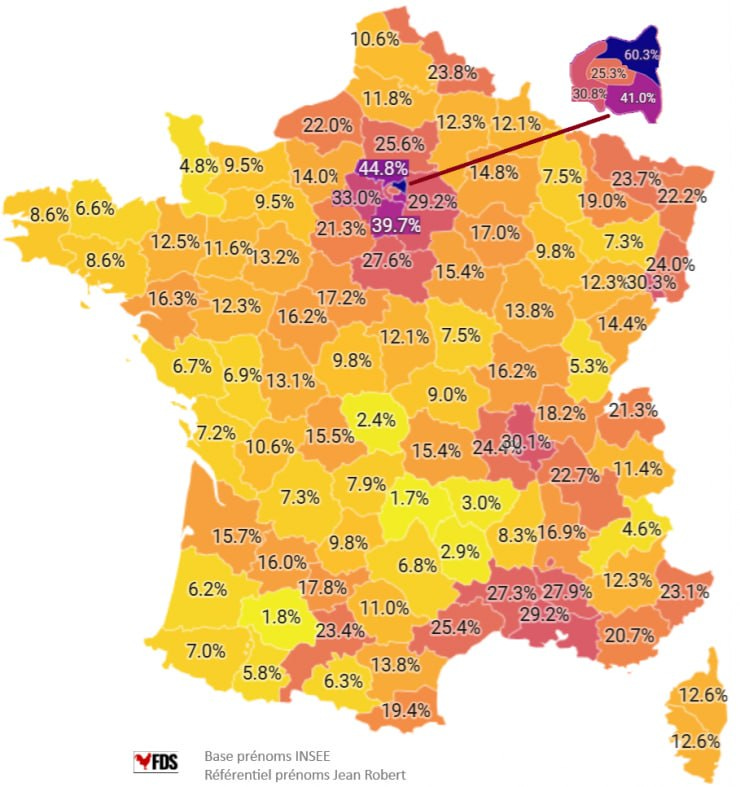
Here’s my replication of this map:
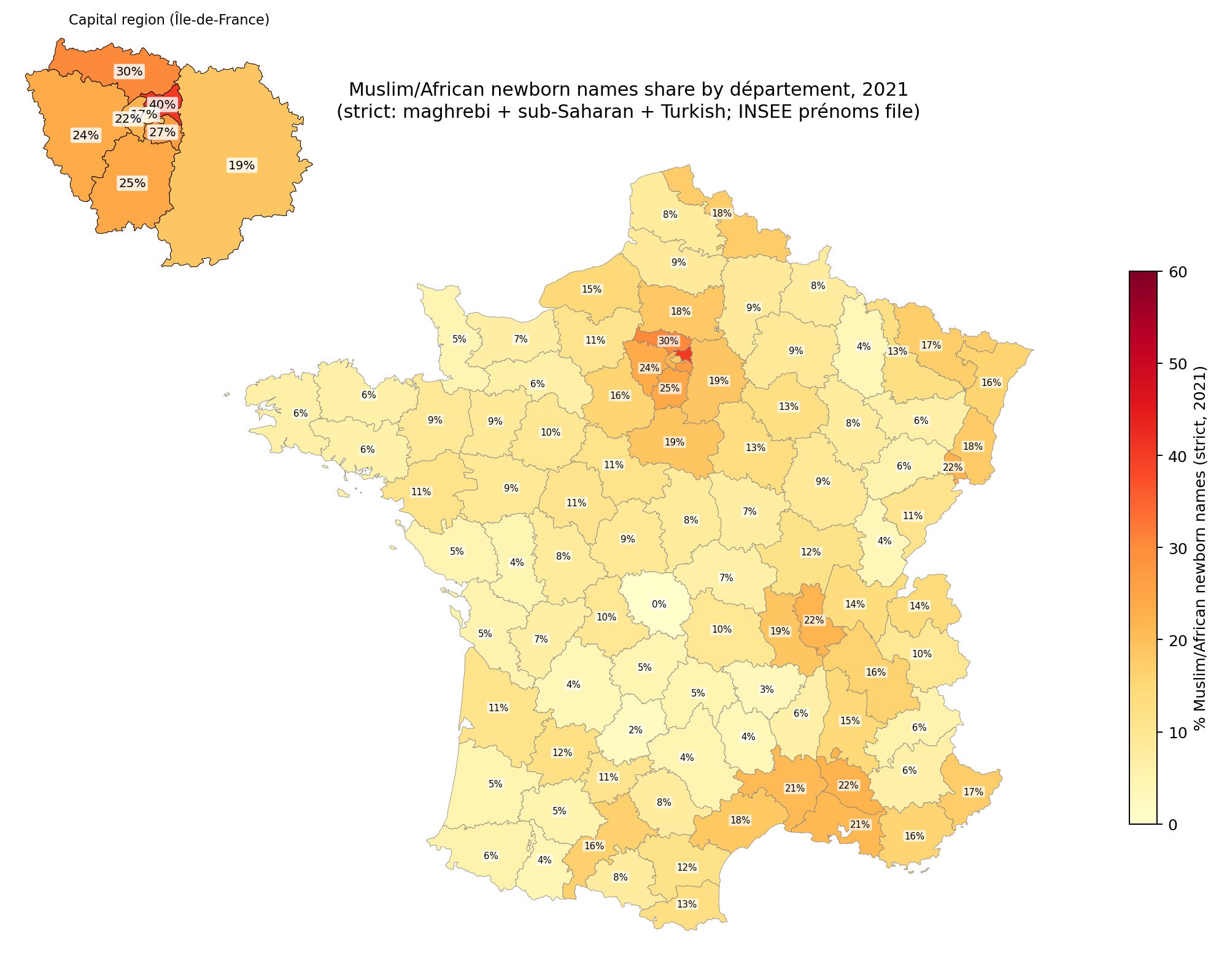
The correlation is about 0.88, but I wasn’t able to resolve the causes of the discrepancy. Notice that Muslims are heavily represented in the north and east of Paris. This is very helpful because population density or urbanization confounds many social metrics that we can look at, so having a city split into different parts with roughly equal urbanization/population density means we can control for this factor effectively. There are some names that are common among Muslims but also common among Europeans, like Sara(h) and Adam. One could include these, and thus count some Europeans, or not include them, and miss some Muslims. Either way gives some errors and it’s not clear which is more accurate. The stricter standard underestimates the Muslim/African% (MA) of newborns, but hopefully is not too biased. It is worth noting that newborns is a flow metric -- the new people entering the population at age 0 -- rather than a stock metric, of the existing population. Stock metrics are what we want since these are most relevant to the current socioeconomic performance of the people in some location, but we will have to use the flow metric as a proxy. The two metrics will eventually align with each other given infinite time without further changes, but at any given time may not, and does not in the west because Europeans are older on average and have lower fertility (usually). Thus the newborn names will both over- and underestimate the MA% of the total population. It seems pretty accurate, though, because this is the correlation with the sickle cell anemia data for the regions: