
Your job, their job, and politics
How occupations relate to politics

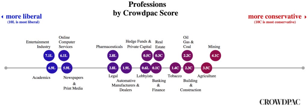
Most people know that political opinions are related to which job people are in. But which exactly? While there are many ways to quantify this, two teams looked at donations to political parties. The data is from USA, so may not generalize 100% to your country, but the broad strokes are likely to be the same.
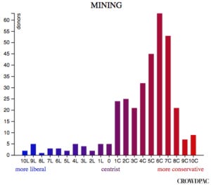
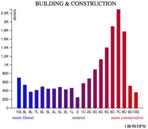
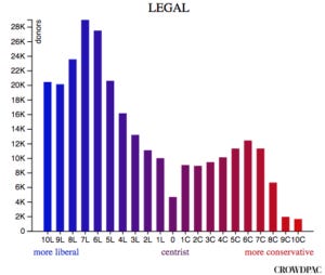
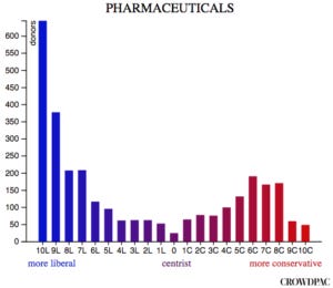
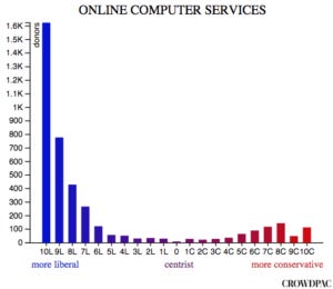
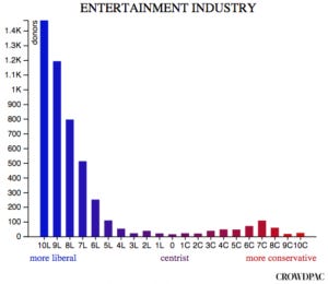
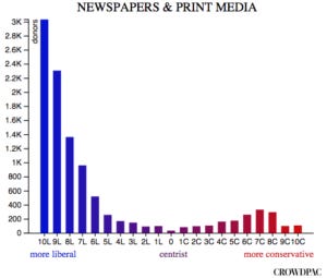
Crowdpac, 2014
Businessinsider has the story:
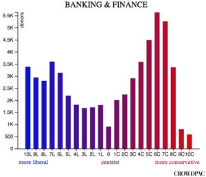
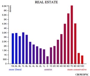
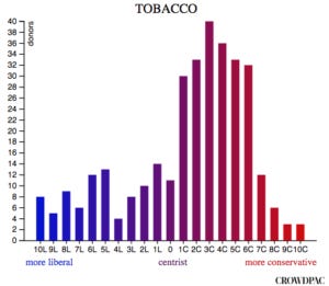
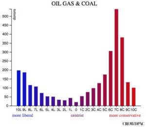
Crowdpac, a non-partisan non-profit dedicated to political data analysis, used federal campaign contribution records dating back to 1980 in order to estimate where various officials and donors fall on the political spectrum. They scored individual donors as being more liberal or conservative based on what kinds of candidates they gave to.
I cannot find anything else about this report, really, so we don't know exactly how much to trust them. Nevertheless, here are the figures:


(Substack does not appear to support multiple images per line.)
So, some professions are roughly even in terms of donations, some are very left-leaning, some very right-leaning. If this was a simple matter of counting donations by party, one would simply get a ratio for each field. But somehow they have a distribution, so I am not sure what they are counting exactly. Maybe they have the various politicians ranked from left to right, and thus one may differentiate between donating to an average Republican vs. an extreme Republican vs. a centrist Republican.
Edited to add: It seems these results are actually just recolored and copied from this 2013 study Adam Bonica! He did indeed use a roll-call type method to estimate within party political positions.
Verdantlabs, 2015
The original blogpost is here. They describe the methods thus:
This analysis is possible because the Federal Election Commission (FEC) provides data that reveals who made what contribution to which political campaign, when they contributed, how much they contributed, what they call their occupation, and other info. We aggregated that data and applied a simple formula for each occupation:
Dem % for occupation = # of people who primarily gave to Dems / (total Dem + Rep contributors)
A caveat with this methodology is that we assume Democrats and Republicans contribute at a similar rate to each other within each profession. In other words, we assume that a 75 / 25 split of contributions by Democratic teachers vs. Republican teachers translates to a 75 / 25 split of Democrat vs. Republican teachers in the general populace. If it's actually the case that, say, Republican teachers are looser with their wallets and have a higher per capita contribution rate, our ratio for that profession will be a bit skewed. Thus, the ratios should be viewed as approximate.
That assumption is likely false given that we know lefties are more interested in politics in general. Still, the results look pretty much like one would expect. There is an interactive website, so I won't post everything here except for some findings of interest:
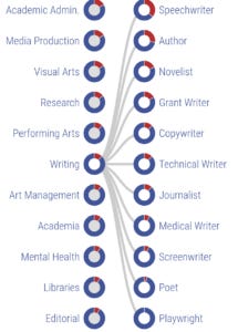


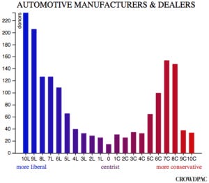
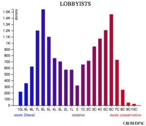
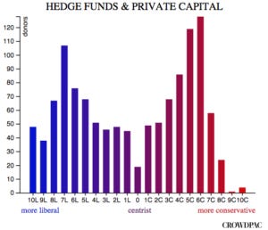
In general, there is a lot of variation inside of many categories. Taxis drivers are left-wing but truck drivers are right-wing. Why? I would guess taxi drivers are mainly in major cities, which are left-wing, and they are to a much larger extent recent immigrants, who are also more left-wing. The navy is the least right-wing part of the military, which is interesting in itself. It fits the pattern in Nazi Germany, where supposedly the Kriegsmarine (navy) was less Nazified than the Heer (army) and the Luftwaffe (airforce). Any kind of writer (extreme verbal tilt!) is essentially far left territory, with speech writers being the least (presumably because they work for Republicans). Playwrights were 100% left-wing in this sample (100 donors to 0!). Journalists come out at 88 to 12, as expected by every other survey on the topic pretty much (see also our study). I recommend browsing through the various groups. The various differences between medical specialties are amusing. The most right-wing is urology, or penis specialists (why??), the most left-wing is physician-scientist (must be a small sample!). They did not include psychiatrists though these are usually quite left-wing. NYT has some more data, showing the relationship to salary:

There seems to be very few if any stereotype studies of professions/occupations. But these data are really ripe for such studies. If someone is interested in helping study this, either by helping with setting up surveys or donating funds for research, email me (emil@emilkirkegaard.dk).